Have you ever wondered what brand typography is or why it’s so important? You’re not alone. Branding can be pretty confusing. That’s why I want to address some of the most common questions about brand typography in this article.
Whether you’re a fellow brand designer or a small business owner, I hope this article provides some clarity.
So, here are some key questions and insights you may have about brand typography:
What is brand typography?
Brand typography involves intentionally choosing and applying fonts to reflect and strengthen a brand’s unique personality and identity.
It’s not just about selecting aesthetically pleasing fonts; it’s about creating a standardised system for all text elements, ensuring consistency and readability across headlines, body text, and other typographic components.
This process helps establish a distinct and memorable brand identity that reinforces the brand’s core message and values.
By carefully selecting and consistently using specific fonts or typefaces, brands can convey their personality and tone, resonate with their target audience, and differentiate themselves from competitors. This ensures a consistent and recognisable image across all platforms.
Research by Jenni Romaniuk of the Ehrenberg Bass Institute has shown that typography can be one of the most distinctive brand assets. Fonts are more ownable than many other elements, including colours.
You may find my article on building distinctive brand assets helpful.
Why is typography so important for a brand?
Brand typography plays a crucial role in shaping how the audience perceives a brand. A well-chosen typeface can evoke specific emotions and associations, reinforcing the brand’s message, personality, and values.
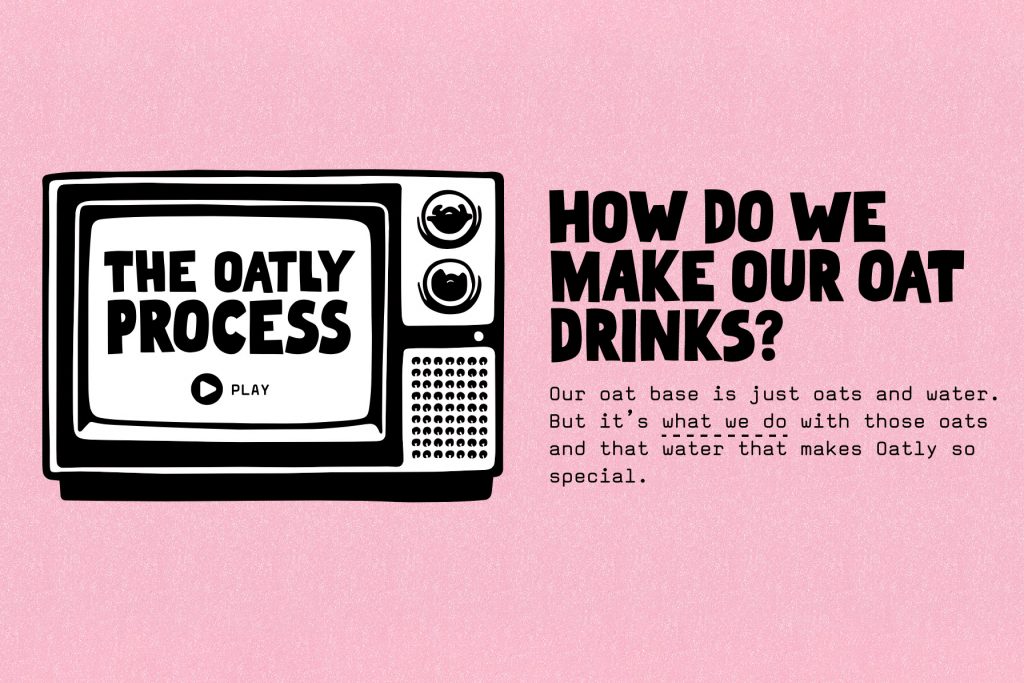
For instance, consider Oatly’s playful typography, which effectively reflects the company’s unconventional and rebellious identity.
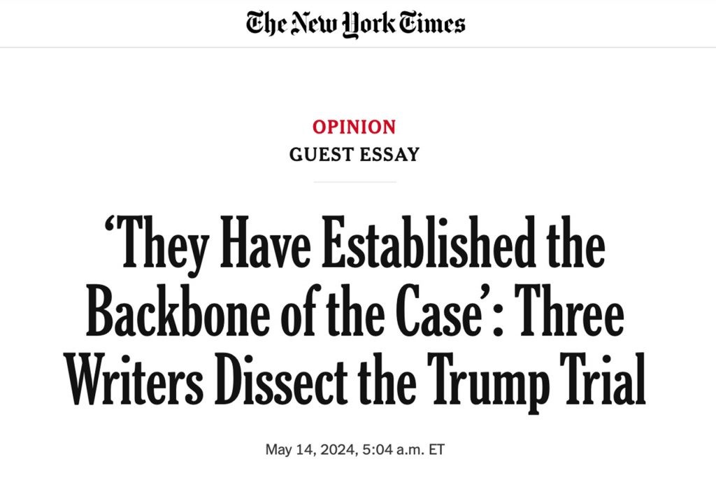
In contrast, The New York Times uses a classic serif typeface (NYT Cheltenham) to communicate tradition and reliability, appealing to readers seeking credible news sources.
Consistency in typography ensures that all brand communications, whether digital or print, are cohesive—no matter who’s designing them.
Consistent brand typography helps establish a visual hierarchy, guiding the viewer’s attention and making the content easier to digest.
Moreover, consistent typography fosters a sense of professionalism and reliability, which is important for building trust and brand recognition.
How does typography contribute to a brand’s overall identity?
Typography is a key element of your brand identity design.
Along with other elements, such as brand colours or tone of voice, it underlines the brand personality and values, differentiates the brand and conveys certain emotions. It also creates consistency across all brand touchpoints.
All brand elements should work harmoniously together to create a consistent, differentiated and recognisable brand identity.
How do you choose the right fonts for your brand?
With so many fonts available, selecting the right ones for your brand can feel overwhelming. However, when you start with the foundational brand strategy, work becomes more manageable.
Start by understanding your brand’s competition, audience, strengths, and positioning.
Next, define the goals for your typography. What emotions and associations should it evoke? How should the brand feel? What can make it stand out?
Then, identify your brand’s personality and select fonts that align with it. A minimalist sans-serif font may be ideal for a tech start-up, while a luxurious serif font could suit a high-end fashion brand. The key is to match the font style with the brand’s values and the emotions you wish to evoke in your audience.
Remember that legibility should always be a priority.
For a deep dive, you may enjoy my article: Everything You Need to Know About Choosing Brand Fonts
What are the main types of fonts and their associations?
Different types of fonts convey various messages. Here are the main types:
- Serif Fonts: Traditional and reliable serif fonts are often associated with authority and professionalism. Brands like The New York Times and Dior use serif fonts to communicate trust and heritage. Modern serifs, as used by brands like WeTransfer, can convey creativity while maintaining a sense of sophistication.
- Sans Serif Fonts: Modern and clean, sans serif fonts suggest simplicity and efficiency. Companies like Google and LinkedIn use sans-serif fonts to project a contemporary and accessible image.
- Script Fonts: Elegant and sophisticated, script fonts resemble handwriting. Brands like Instagram and Coca-Cola use them to evoke creativity and a personal touch.
- Display Fonts: Bold and eye-catching, display fonts are ideal for making a statement. They add a playful and memorable element to branding, as seen in the iconic fonts used by brands such as Disney.
Where can you find brand fonts?
When choosing brand fonts, you generally have three options: free (open source), paid, or custom.
Here are a few links to help you get started:
You may also like my article: The 25 Best Websites to Find Fonts for Your Brand
What’s the difference between a font and a typeface?
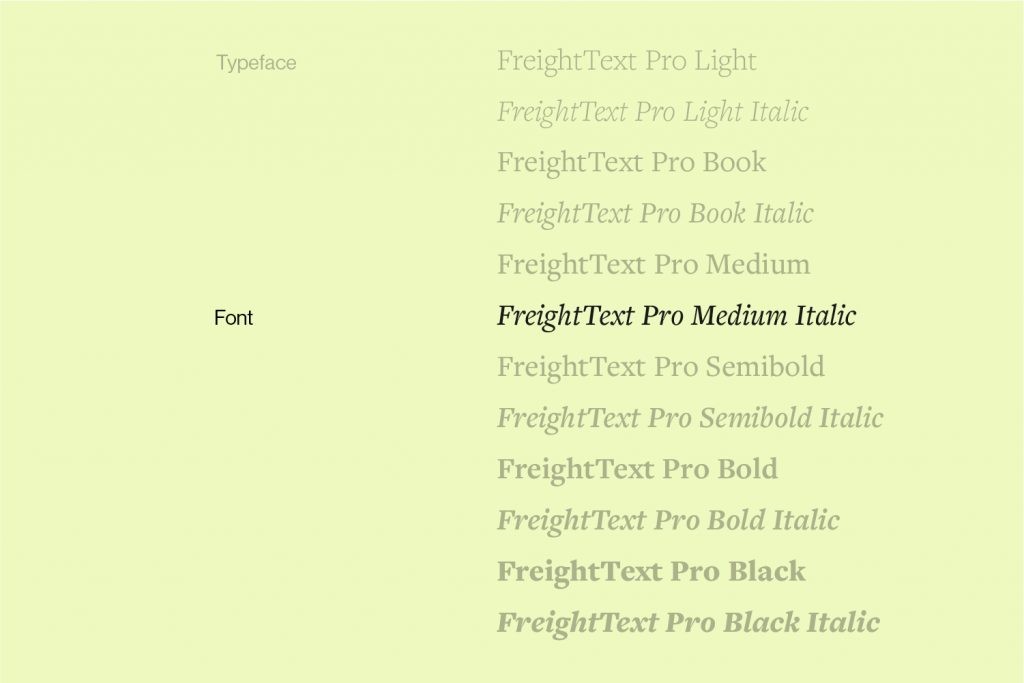
A typeface contains an entire font family of various styles, such as Helvetica (Regular, Light, Bold, etc.). On the other hand, a font refers to one specific style within that family, such as Helvetica Light.
Even though we often refer to “brand fonts,” what you’re really after is a typeface.
Opting for a typeface gives you more flexibility for various applications and the future growth of your brand.
What should you consider when pairing brand fonts?
For font pairing, choose fonts that complement each other and have distinct characteristics.
Here are some font pairing tips:
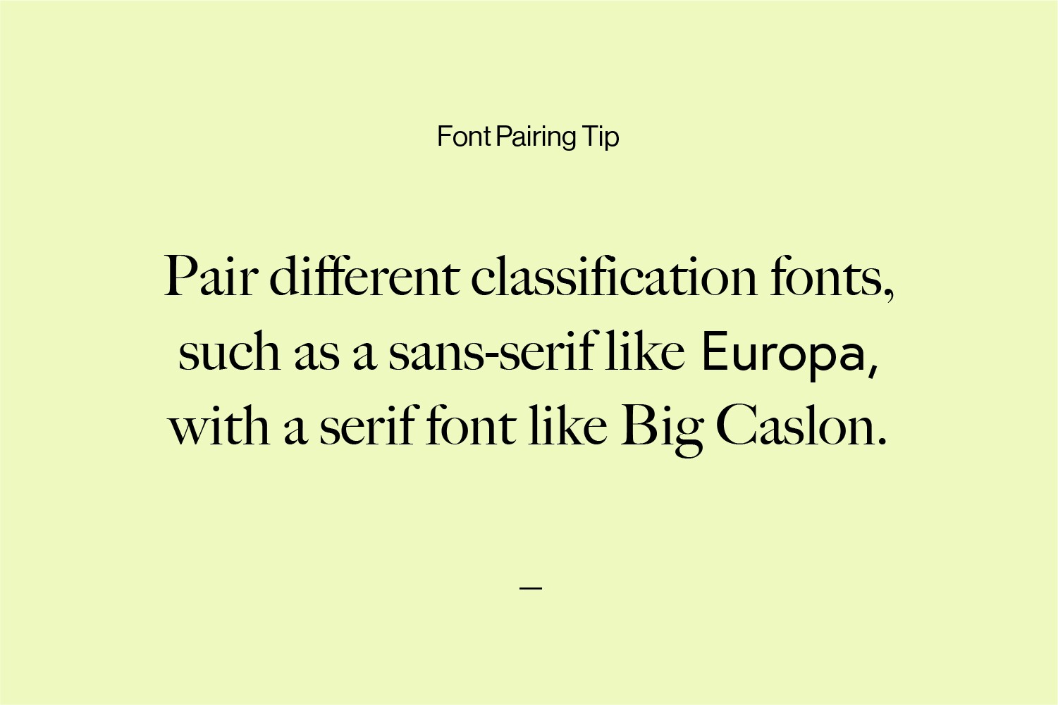
- Avoid pairing two fonts of the same classification. For example, it’s better to pair a sans-serif font with a serif font to create more contrast and avoid competition.
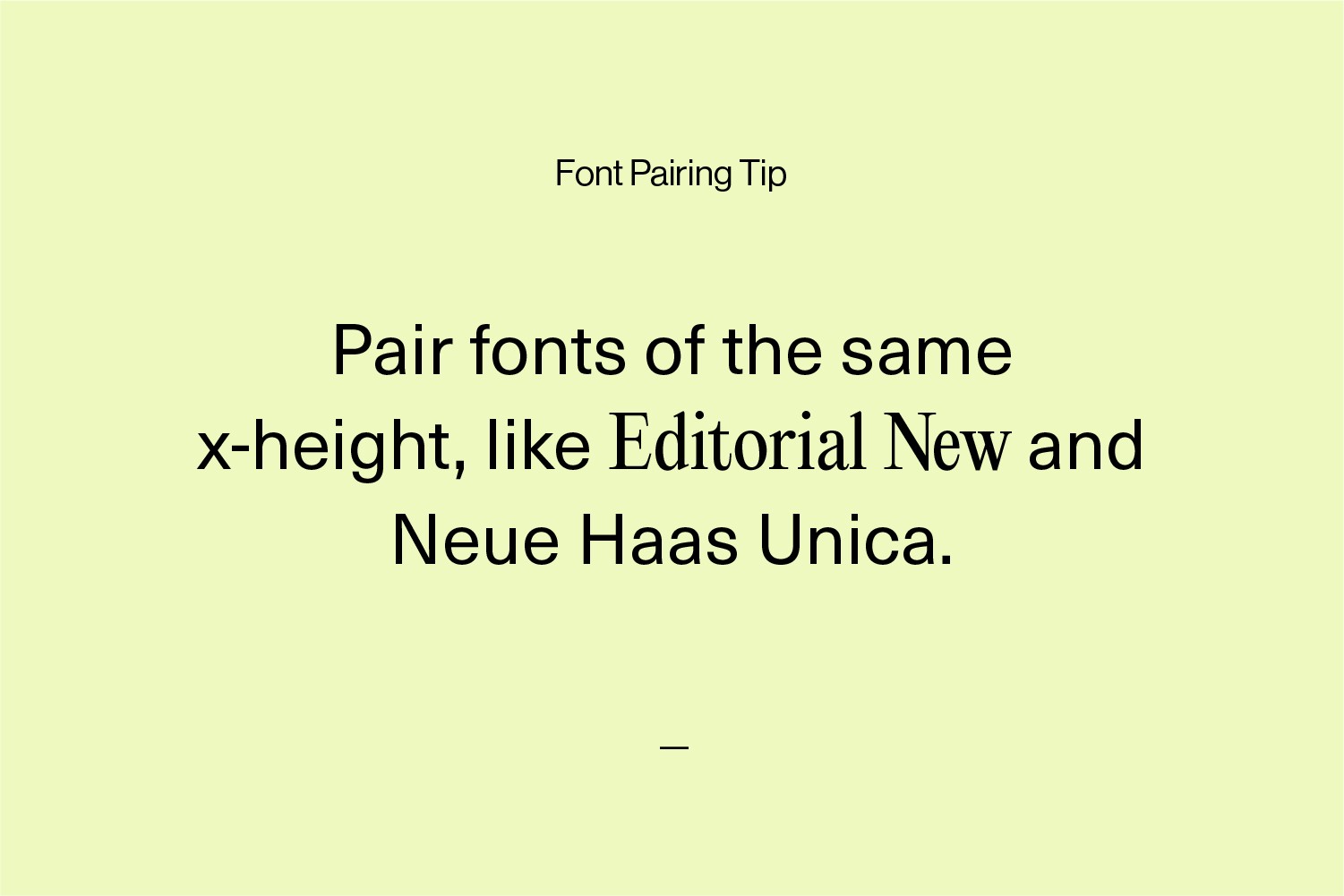
- Select fonts with a similar x-height to create a sense of relatedness.
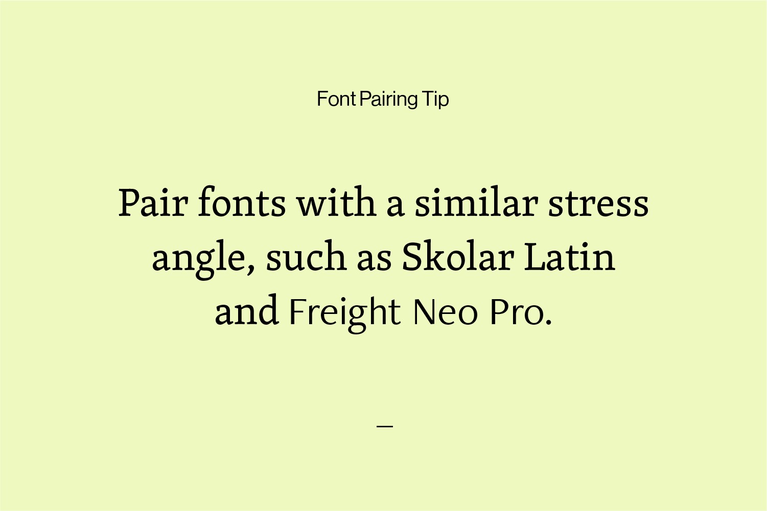
- Choose those with similar stress angles (vertical or diagonal stress).
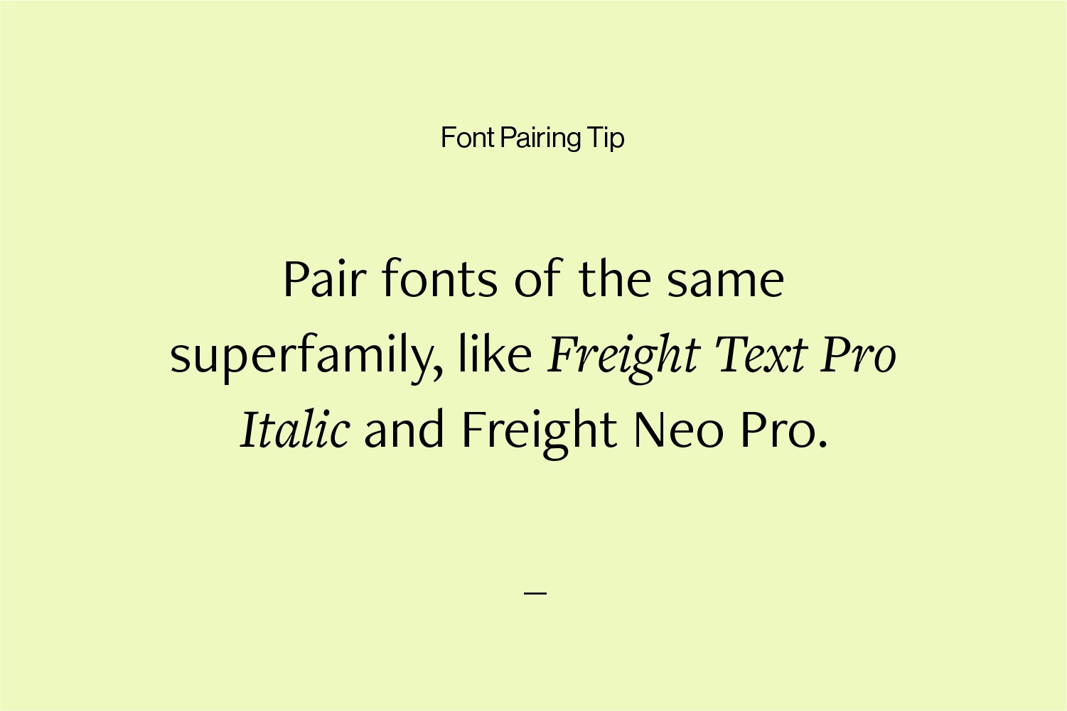
- Superfamilies often have different styles that can be paired, like Roboto and Roboto Slab.
How do you ensure consistency in your brand typography?
You can ensure standardised implementation by creating and following brand guidelines and briefing the people responsible for implementation accordingly.
It can also be helpful to use pre-designed templates, especially for small companies with no in-house design team.
What are brand typography guidelines?
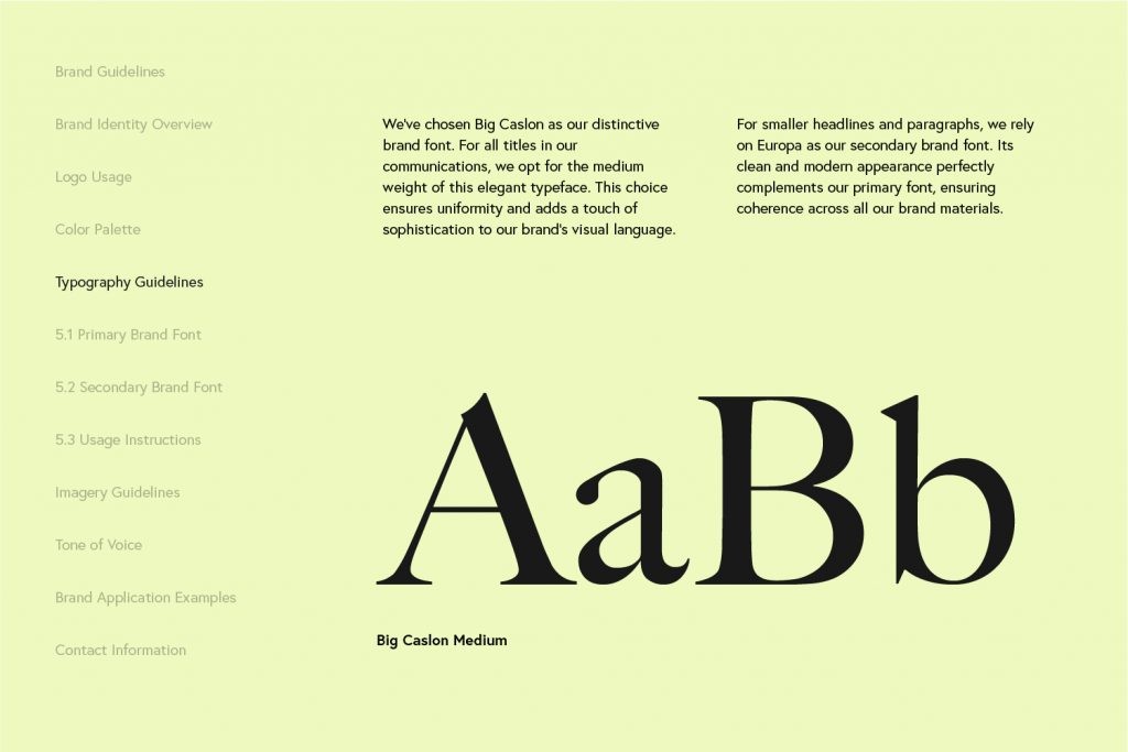
Brand typography guidelines outline rules and recommendations for consistently applying your brand typography—whether for digital or print applications.
They provide clear instructions on which fonts to use for different purposes—such as headlines, body text or captions—and specify details such as line spacing, font size and colour to maintain consistency.
These guidelines often include examples of right and wrong applications and show the brand in use with the help of mockups.
What should you consider when designing typography for digital platforms versus print materials?
When designing typography for digital platforms versus print materials, consider the following:
For digital platforms:
- Check the licence agreements for fonts. Some may have restrictions on website traffic or usage.
- Limit the number of web fonts you use to improve your website’s loading times and overall performance.
- Ensure the fonts you choose are readable on different screen sizes and resolutions. Your logo, in particular, can become relatively small on mobile devices.
For print materials:
- Choose fonts that remain clear and legible even at smaller print sizes and do not have complicated details. With smaller elements and thin lines, it can be difficult to reproduce them correctly in print.
- Note that depending on the printing process, some fonts may be poorly reproduced. Problems could include ink bleeding or loss of detail.
- Also, consider the texture and colour of the paper, as this can affect how fonts are reproduced in print.
What are good brand typography resources?
There are countless resources, such as books, courses and websites on typography and branding.
Here are a few I like.
For learning typography:
- Flawless Typography Checklist by Typewolf
- Typography 01 by the Futur
- Stop Stealing Sheep & Find Out How Type Works by Erik Spiekermann
- Thinking with Type by Ellen Lupton
For font inspiration:
What are the dangers of inconsistent brand typography?
Inconsistent typography can confuse customers and weaken their trust in your brand.
If the fonts in brand materials are constantly changing, it becomes difficult for people to recognise and remember your brand and recall your brand name easily, which means they might overlook your products or services.
I cover this in more detail in What Makes a Brand Recognisable?
And finally, an inconsistent look signals your company is unprofessional. As a result, customers may opt for your competitors’ products because they assume they are more credible and professional.
What are the basic rules of typography?
Following a few basic rules will ensure that your typography is visually appealing and easy to read.
These principles include:
- Adequate spacing between letters (kerning) and lines (leading) ensures better legibility.
- A hierarchy of information can be created by using different font sizes and weights.
- Contrast and white space can help draw the viewer’s attention to important elements.
- The text should remain legible in different sizes and on different backgrounds.
For more info, you’ll probably enjoy these 20 tips on improving your typography skills.
Conclusion
Brand typography is about more than just choosing beautiful fonts. It’s about developing a visual language that consistently reflects your brand’s personality, core values and message across different touchpoints.
By mastering your brand’s typography, you can boost its visual identity and make it stand out in the eyes of your audience.
Ready to elevate your brand identity? Contact me, and let’s see how I can help.


