To show you what strong positioning looks like in practice, I’ve gathered 20 examples from both small businesses and global names. Each one shows a different way to stand out. But you’ll notice that some would have fit multiple positioning strategy examples.
If you want to understand the thinking behind these moves, I’ve answered the most common questions about brand positioning at the end.
In this article:
- 20 brand positioning examples across over 10 categories
- What each brand did differently and why it worked
- A quick comparison table of positioning types
- Answers to the most common questions about brand positioning strategy
Brand positioning examples across 13 strategies
| Brand | Positioning Strategy | Key Differentiator | Why It Works |
|---|---|---|---|
| Oatly | Personality & Values | Chaotic irreverence | People buy the version of themselves the brand reflects |
| Liquid Death | Personality | Heavy metal aesthetic | Solves the social problem of blending in without drinking boring water |
| Einhorn | Personality & Values | Playful sustainability | Makes an awkward category fun to talk about |
| IKEA | Unmet Need | Democratic design | Created affordable design when there was none |
| Graza | Unmet Need | Functional packaging | Squeeze bottle signals “use me daily” not “save me” |
| Heaps Normal | Unmet Need | Non-apologetic tone | Positions choice over sacrifice |
| Dollar Shave Club | Price | Truth-telling value | Called out the razor industry’s markup |
| Tony’s Chocolonely | Values | Radical transparency | Made the problem of the category visible |
| Who Gives A Crap | Values | Humour + purpose | Personality makes boring products shareable |
| Veja | Values | Zero advertising | Actions speak louder than marketing claims |
| Scrub Daddy | Product Innovation | Smiley face sponge | Makes chores fun and stands out on shelf |
| YT Industries | Distribution | Digital-first DTC | Premium web experience replaces retail markup |
| REI | Co-operative Model | Member ownership | Community over transactions |
| Muji | Simplicity | No-brand philosophy | Anti-branding as a statement |
| Pic’s Peanut Butter | Founder-led | Garage to famous product | Founder’s refusal became the brand |
| Duolingo | Anti-category | Gamified UX | Habit beats skill in language learning |
| Guinness | Weakness-to-strength | 119.5 second pour | Waiting became proof of quality |
| Avis | Weakness-to-strength | “We're #2, we try harder” | Honesty when everyone else overclaims |
| Figma | Experience | Multiplayer design | Changed how designers work together |
| Tylko | Personalisation | Made-to-measure | Removes the fear of “will it fit my space?” |
1. Personality-led positioning examples
What everyone else was doing
Plant-based milk brands like Alpro mostly used leaf and nature imagery, simple fonts, and down-to-earth environmental messaging. This made the category seem gentle and wholesome, but also a bit samey.
What Oatly did instead
Oatly decided to do their own thing. Their most famous ads weren’t even ads. Instead, they were printed straight on the carton, in a chaotic layout with unfiltered copy about being a weird oat-drink company.
When the Swedish dairy industry sued Oatly over its slogan, “It’s like milk, but made for humans”, Oatly just published the court ruling in full as an ad campaign. And when they got to the Super Bowl in 2021, they used it to show their CEO singing “Wow, no cow” on his own in a field.
Why it works
Oatly’s irreverent tone is at the heart of their brand. While others try to look serious, Oatly leans into being weird, and that’s what gets them noticed. And when they turn a legal hurdle into a marketing win, it shows they really believe in what they’re doing.
What everyone else was doing
Water brands often promote a sense of calm and well-being. Their branding is often hard to tell apart, with imagery ranging from pale blues to clean whites, complete with Alpine springs. Whatever the brand—Evian, Volvic or Fiji—they all basically claim that their water is pure and refreshing.
What Liquid Death did instead
Liquid Death saw people who wanted to fit in at bars, festivals and parties without drinking alcohol, but didn’t want to look like they were drinking wellness water.
So, they made water look like beer in tall black cans with skulls and the tagline “Murder Your Thirst”. It’s the same product, but it creates a different world. People won’t stand out for not drinking, and the can will definitely catch people’s attention on the shelf.
Why it works
Liquid Death solved a social problem. Their can looks like everyone else’s drink. And the heavy metal feel makes choosing water feel almost rebellious instead of boring.
The logic behind it
Both brands leverage self-congruence. People don’t just buy the product; they buy the version of themselves the brand reflects—in this case, someone tired of corporate polish who values authenticity over perfection.
What everyone else was doing
The condom and period product category in Germany was split between clinical and medical on one side, and aggressively macho on the other.
What Einhorn did instead
The Berlin-based brand made a category that had none—fun. They went for bright colours, unicorns, fun packaging and a commitment to sustainability, including vegan, fair trade and plastic-free options.
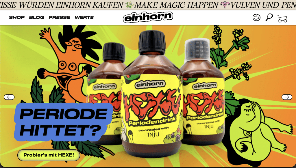
Why it works
Einhorn used the cringe factor in this category as an opportunity to stand out. They put a smile on people’s faces and made them want to buy their products. This earned them a loyal customer base, which is pretty rare in a market where most people just buy whatever is available.
2. Unmet need positioning
IKEA
What everyone else was doing
Back in the 1940s, furniture was either too expensive for most families or just plain ugly. People assumed that good design had to be expensive and that someone else would assemble it for you.
What IKEA did instead
IKEA’s founder, Ingvar Kamprad, realised that young people setting up their first homes wanted affordable, well-designed furniture and were willing to do the work themselves if the price was right. He invented the flat-pack, which drastically reduced production, transport and retail prices.
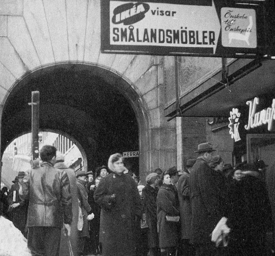
Why it works
IKEA spotted an opportunity and went for it, creating a whole new category. They took what started out as a compromise—assembling your own furniture—and turned it into a core part of their identity.
What everyone else was doing
Olive oil came in two forms: either generic supermarket brands that nobody thought about, or precious artisan bottles nobody wanted to use. The premium olive oil sector had positioned its products so exclusively that people saved them for special occasions.
What Graza did instead
Graza just used a squeeze bottle. That’s all there is to it. But it sends the message that olive oil is for everyday cooking, not for sitting on the shelf.
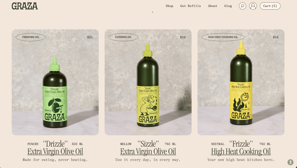
Why it works
The squeeze bottle makes it clear that this olive oil is meant to be used, not just looked at. This small change to the packaging has totally changed how people see the product. And the bottle really stands out next to all the glass bottles.
The logic behind it
Graza uses Category Innovation. By moving olive oil from a glass bottle to a squeeze bottle, they shifted the product’s psychological framing from a “precious ingredient” to a “functional kitchen tool”.
What everyone else was doing
Non-alcoholic beer was marketed as a sacrifice, as something for pregnant women or drivers. The category pretty much apologised for itself, relying on wellness messaging to justify its existence.
What Heaps Normal did instead
The Australian brand shook things up. They created non-alcoholic beer for people who enjoy beer but choose not to drink sometimes.
While Liquid Death made water look like beer to help non-drinkers blend in, Heaps Normal did the opposite, positioning their beer against water.
They parodied 1980s anti-drug ads with their “Just Say No To Water” campaign, which basically said that when you’re not drinking, don’t settle for boring drinks.
Why it works
That reframe—from healthy-alternative to better-than-water—opened up a much larger audience than wellness messaging ever could. While Liquid Death disguised water as beer, Heaps Normal proudly markets non-alcoholic beer.
3. Price-led positioning
What everyone else was doing
Gillette had spent years building a whole mythology around shaving technology, with premium blades and vibrating handles. The category was built on pseudo-scientific marketing and the assumption that innovation justified a $25 refill pack.
What Dollar Shave Club did instead
Dollar Shave Club called out the industry. They offered a $1-a-month subscription and made a launch video that cost next to nothing but received 12 million views in its first month. Essentially, they said: “You’ve been paying for marketing, not razors.”
Why it works
It’s true that Dollar Shave Club offered cheaper razors, but they also made people feel clever for switching to them. Their honesty really paid off. Just three years after launching, Unilever bought the brand for $1 billion.
4. Values-led positioning
What everyone else was doing
Everyone knew the chocolate industry used child labour and slavery in West African cocoa supply chains, but no one did anything about it. Cadbury, Nestlé and Mars all had bright packaging and feel-good advertising, but kept their supply chain info deliberately vague.
What Tony’s Chocolonely did instead
Tony’s made the problem their whole brand. A journalist from the Netherlands set up the company after he couldn’t prosecute the chocolate industry for slavery. The unequal bar segments represent supply chain inequality. The bold packaging talks openly about slave-free chocolate.
One of their adverts shows Tony literally fighting inequality—“There’s fight in every bite”.
Why it works
It takes guts to speak up when everyone else stays quiet, and that’s exactly what Tony’s Chocolonely did. People feel good about eating this chocolate, and it tastes great, too. And that’s important, because values only work if the product delivers.
What everyone else was doing
Toilet paper was a pretty boring category, with all the focus on how soft it was, and the usual cute puppy ads.
What Who Gives A Crap did instead
They took the most boring category imaginable and turned it into something people could talk about. By using bamboo and recycled paper and donating 50% of profits to sanitation charities, as well as having a funny brand voice, they really got people interested.
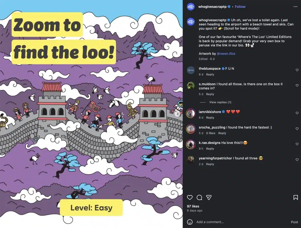
Why it works
Who Gives A Crap combined three ideas: a funny personality, a worthwhile mission and a subscription model. In a market with no personality or purpose, this combination inspired people to take pictures of their bathroom shelves and share them online.
The logic behind it
This is Altruistic Positioning combined with a strong visual disruption. They turned a boring, hidden-away commodity into a bold statement piece, allowing customers to feel like change-makers through a routine household purchase.
What everyone else was doing
Sneaker brands that care about ethics were showing how eco-friendly they were with all sorts of certifications, carbon calculators and sustainability reports. The more virtuous they claimed to be, the more budget went into proving it.
What Veja did instead
They literally spent nothing on advertising. There weren’t any billboards or influencer campaigns. Instead, every euro that would have been spent on marketing went towards supply chain transparency and fair sourcing.
Why it works
Veja’s no-advertising policy is a bit of a slap in the face for other brands in the category. When other brands spend millions on greenwashing, Veja puts that money into fair wages and organic materials, showing the difference.
When Emma Watson wore their trainers because she genuinely liked them—and not because of the sponsorship—it proved the approach works.
5. Product innovation positioning
What everyone else was doing
Cleaning sponges were functional commodities. They all used the same boring rectangular shapes and colours. Brands were competing on how well they could absorb or last, but nobody ever thought twice about the shape.
What Scrub Daddy did instead
They simply created a sponge with a smiley face that’s also functional. It changes texture based on water temperature—firm in cold water for scrubbing and soft in warm water for gentle cleaning—and the eyes and mouth are helpful for hard-to-reach spots.
Back in 2012, founder Aaron Krause pitched it on Shark Tank and ended up making the show’s most successful product ever, with over $670 million in sales.
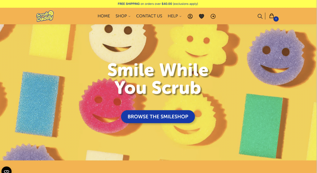
Why it works
The smiley face makes washing up more fun, and it’s useful too. That blend of fun and practicality is what makes the brand stand out. It also gets kids to actually want to help with the dishes, which makes it attractive to parents.
The logic behind it
This brand uses Anthropomorphism to create an emotional connection with a tool. By giving a sponge a face and a personality, they transformed a mundane chore into an enjoyable experience, justifying a higher price point through perceived value.
6. Distribution-led positioning
What everyone else was doing
The premium mountain bike market relied on traditional specialist retailers. Brands such as Trek, Specialized and Santa Cruz sold their products through dealer networks, offering high margins. There was an assumption that bikes this expensive needed to be seen and tested in person.
What YT Industries did instead
YT was one of the first to adopt the direct-to-consumer model. By cutting out the middleman, they could offer the same bike with better specs at a lower price. Bikes are shipped straight from their German warehouse to your doorstep.
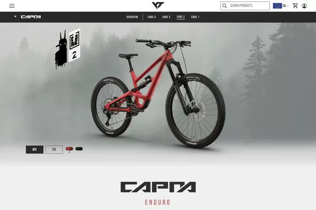
Why it works
YT proved that premium bike customers do their research and don’t need dealers to help them make their decision. YT still lets customers try bikes through test events and a demo track at their Germany headquarters, and has also invested in a premium website and user experience.
I’ve been through the YT customer journey myself. Their positioning relies entirely on a premium digital experience replacing the traditional physical dealership. The brand system has to do all the heavy lifting.
The logic behind it
This direct-to-consumer model only works if the digital experience feels as premium as the product. For brands like YT, the website has to replace the entire dealership experience.
7. Community-led positioning
What everyone else was doing
Outdoor retail was competitive, margin-driven and pretty much all identical. They were all fighting for the same customer, offering the same gear and brands.
What REI did instead
REI still sells the same brands and gear, but they set themselves up as a consumer co-op. Members pay a one-time $30 fee and get annual dividends, as well as a say in how the company is run. On Black Friday, REI closes all its stores and pays employees to go outside instead.
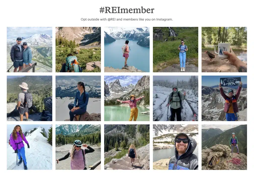
Why it works
REI’s co-op model shows customers that the brand cares about them, which is something bigger companies can’t do. This gets people invested and involved in the brand.
The logic behind it
In a world where Amazon can sell the same tent cheaper, REI cannot compete on price. By positioning themselves as a Co-op, they move from competing on price to membership—from customer to stakeholder.
8. Simplicity-led positioning
What everyone else was doing
Consumer goods brands tend to compete mostly on logos and status. Clothes, homeware, stationery—you name it—it’s all branded and priced accordingly.
What they did instead
Muji doesn’t brand its products and their items don’t have unnecessary features. The brand’s name literally translates as “no-brand quality goods”. Everything at Muji is basic and they charge fair prices.
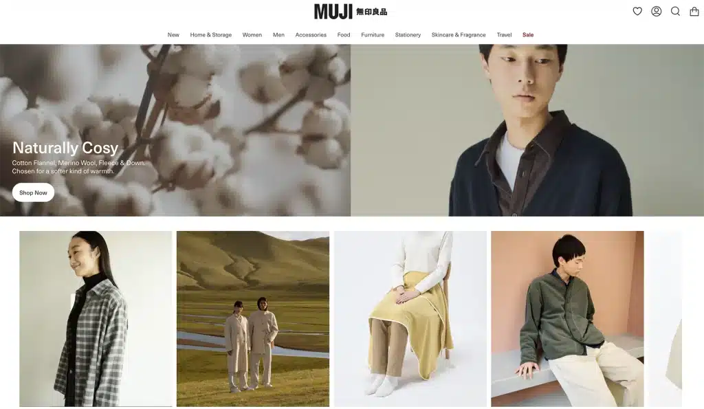
Why it works
Muji’s plain look is a deliberate choice that reflects their beliefs. Their customers are buying into a mindset about quality and simplicity.
The logic behind it
Muji’s logic is built on Processing Fluency—by removing the noise of logos and excess, they reduce the cognitive load for the consumer, making the choice for simplicity feel like a relief.
9. Founder-led positioning
What everyone else was doing
Peanut butter in New Zealand was mass-produced and full of sugar. No one thought twice about it.
What Pic’s did instead
Pic Picot bought supermarket peanut butter, didn’t like it, rang to complain, and was told most people preferred it that way. He disagreed, so he bought a concrete mixer, half a tonne of peanuts, and started making his own in a Nelson garage with just roasted peanuts and salt.
Pic’s is now New Zealand’s number one peanut butter by value—with 41% market share as of 2025. It’s 50% more expensive than the brands it replaced and is exported to a dozen countries.
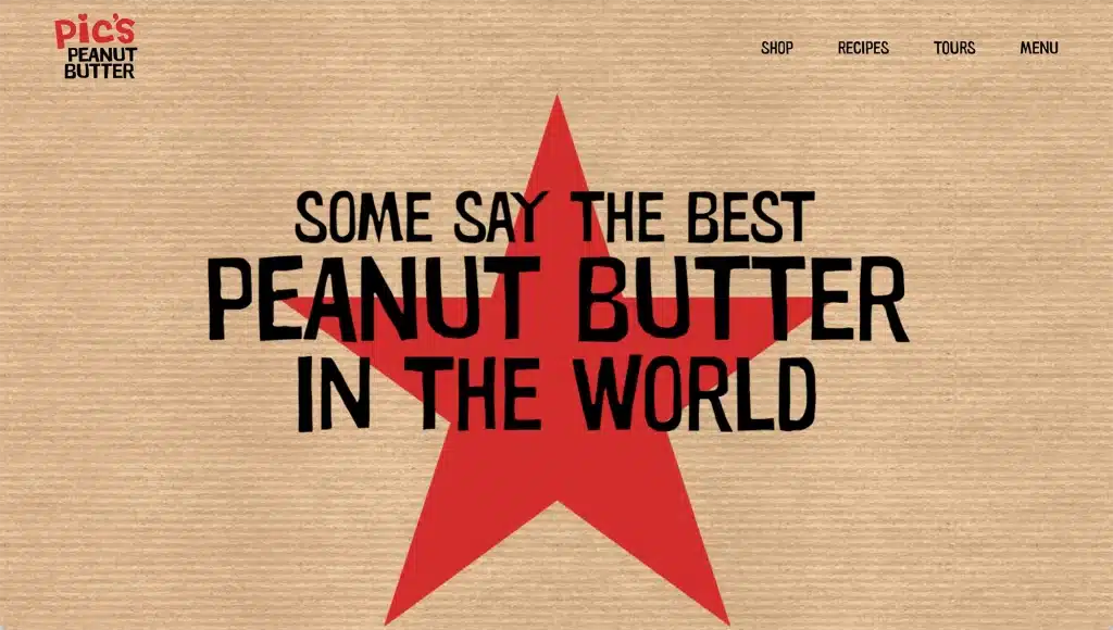
Why it works
Pic’s started because its founder refused to settle for mediocre peanut butter. That rebellious, founder-led origin story became the brand, and it’s authentic because the product actually backs it up.
The logic behind it
Pic’s thrives on Founder-Led Authenticity. In a market filled with faceless corporations, the guy in a garage narrative provides a human anchor that makes the brand feel trustworthy and local.
10. Anti-category positioning
Duolingo
What everyone else was doing
Language learning was either expensive and serious, like Rosetta Stone, university courses and private tutors, or ineffective and forgettable. The category assumed that learning a language required a lot of commitment and investment.
What Duolingo did instead
They made language learning feel like a game instead of a course. It’s free, addictive and based on streaks and rewards.
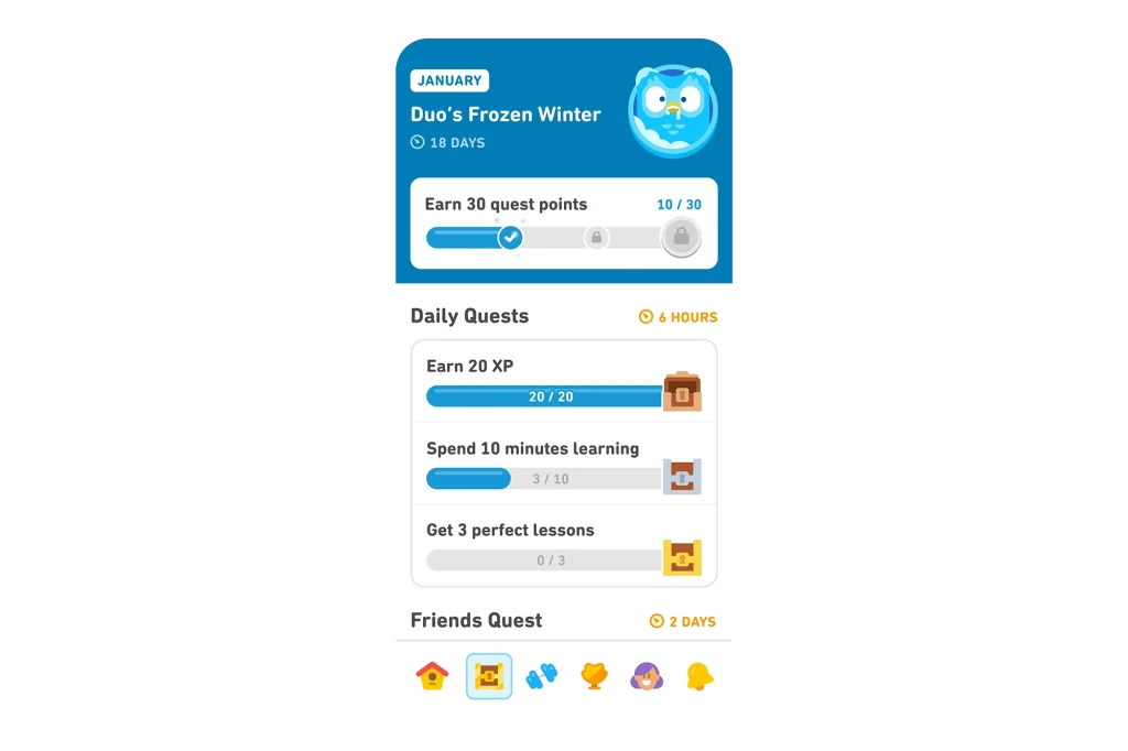
Why it works
The hardest part of learning a language isn’t the skill—it’s staying committed. Duolingo makes lessons fun and easy to stick to, which helps people build a daily habit that lasts. Even the owl’s persistent reminders help keep people coming back.
The logic behind it
Anti-category positioning is most effective when you identify the category’s biggest weakness. For language learning, it’s not a lack of content; it’s a lack of habit.
11. Weakness-into-strength positioning
Guinness
What everyone else was doing
Lager dominated pub culture because it was quick and easy to pour and drink. Guinness, on the other hand, needed a two-part pour that took over two minutes to settle, which was a logistical problem in busy bars where speed mattered.
What they did instead
They refused to apologise for being slow. Instead, they made waiting part of the experience. “Good things come to those who wait” changed the two-minute pour from a problem into proof of craft. The delay became the differentiator.
Why it works
Turning pouring a Guinness into a ritual creates an experience. By the time your pint is ready, you’ve invested something, and it tastes better for it. And this positioning still works today.
The logic behind it
This is a classic example of the Pratfall Effect. By leaning into a flaw (the wait time), Guinness actually makes the brand feel more authentic and superior in quality.
Avis
What everyone else was doing
Back in 1962, Hertz was top of the car rental market and acted like it—showing off how big and reliable it was as a market leader. Avis was stuck in second place and had no obvious way to compete on those terms.
What they did instead
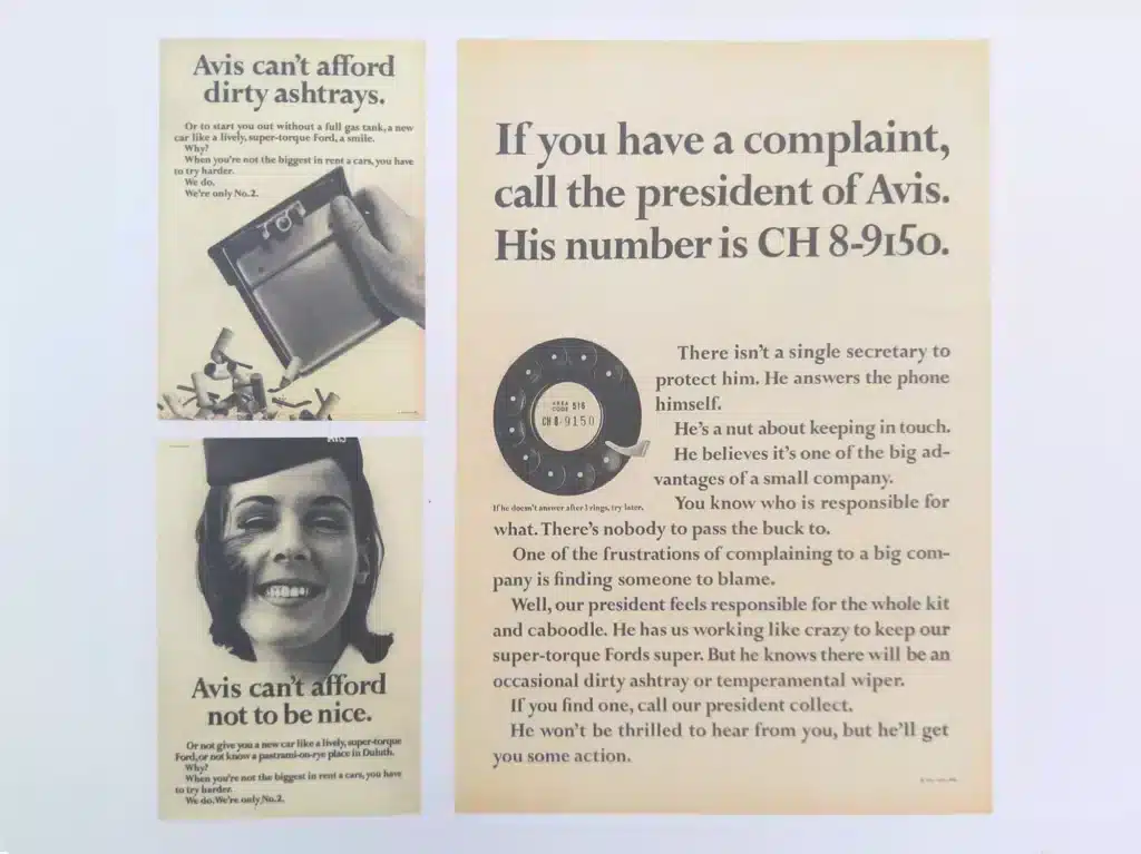
Why it works
The logic behind it
By admitting they were #2 (the flaw), they signalled to the audience: “We have no reason to lie to you.” This vulnerability acts as a psychological trust anchor. Once the customer believes the of weakness, they are primed to believe the strength, too: “We try harder.”
12. Experience-led positioning
What everyone else was doing
Design tools used to be desktop software, which was expensive and complicated. Adobe had been the go-to for decades. Files were saved locally and shared by email. Designers worked alone and handed off static assets to developers slowly and painfully.
What Figma did instead
They made their design software browser-based and fun right from the start. You can have a team of people working on the same file, in real time and wherever they are. There’s no installation or version conflict. And it made handoffs to developers a lot easier.
Why it works
Figma changed how people think about design. Instead of working alone, designers can now work together in real time. Adobe’s $20 billion attempt to buy them shows just how much Figma has changed the game.
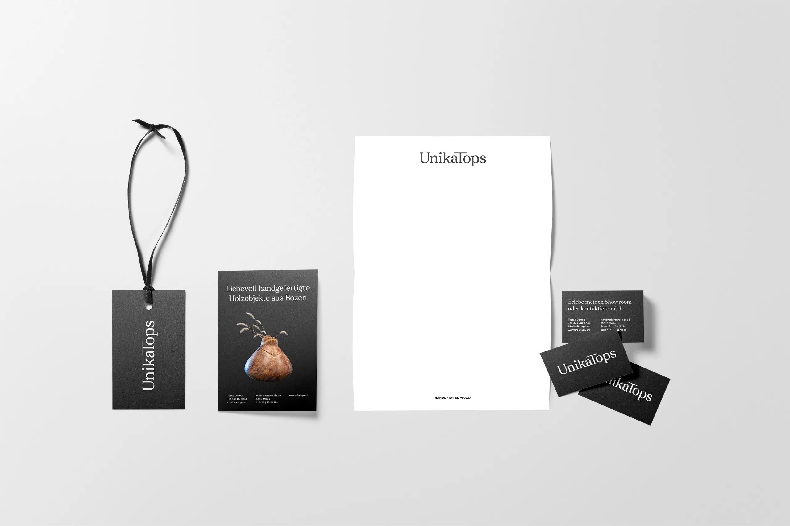
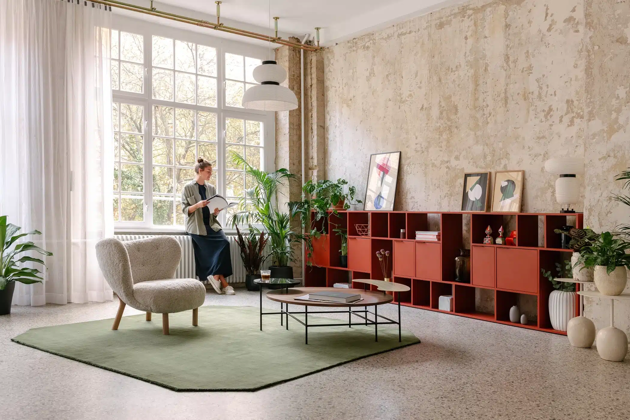
13. Personalisation-led positioning
What everyone else was doing
If you wanted furniture that fit your exact space, you had two choices: buy standard sizes off the shelf and make them work, or commission expensive custom pieces that took weeks to build. Affordable, well-designed, made-to-measure furniture didn’t really exist.
What they did instead
The Warsaw-founded brand’s configurator allows you to specify furniture dimensions, colour, finish and internal layout. An app allows you to view pieces in your space before ordering. Every unit is made to order from sustainably sourced Finnish birch.

Why it works
Tylko saw that the real issue with furniture isn’t cost or quality, but whether it actually fits your space. By prioritising a perfect fit, they offer something that neither IKEA nor a custom joiner can provide. And by building a fun, colourful brand personality around it they tapped into current pop culture.
The logic behind it
Personalisation here isn’t just a feature; it’s a direct solution to a major psychological hurdle. The biggest reason people hesitate to buy furniture is the fear that it won’t fit.
Key positioning principles from these examples
When we look at all 20 brand positioning examples, several patterns appear.
1. Clarity over consensus
The most successful brands have a clear and specific identity, even if that means not everyone will like them. Oatly, Liquid Death and Einhorn don’t try to please everyone. They pick a side and stick with it.
2. Credibility requires product truth
Brands such as Tony’s Chocolonely, Scrub Daddy and Figma are successful because they deliver on their promises. If your values aren’t backed up by quality, nobody will be interested.
3. Weakness can be a strength
Guinness’s slow pour, Avis’s “We Try Harder” campaign and IKEA’s self-assembly furniture are all examples of brands that took what could be seen as a weakness and turned it into a strength.
4. Category rules are negotiable
Heaps Normal ignored wellness trends, Muji skipped branding altogether and Veja opted out of advertising. The brands that succeed are often the ones that challenge what everyone else takes for granted.
5. Consistency compounds
These positions don’t pay off overnight. Veja’s decision not to advertise didn’t seem to matter much at first, but after five years of word-of-mouth growth, it became their biggest advantage.
Scrub Daddy was rejected by every retailer before Shark Tank. A smiley face sponge seemed gimmicky until people realised it actually made washing up easier. Building a strong position takes time and consistency.
Frequent questions about brand positioning
What is brand positioning?
Brand positioning is how your brand is seen compared to your competitors. It’s not what you say that matters, it’s what people think when they hear your brand’s name. If you’re well-positioned, there’s a clear, compelling reason to choose you over the alternatives.
What is the difference between brand positioning and brand identity?
Brand positioning is about where you sit in the market compared to competitors. Your brand identity is how you express that position—your visual language, tone of voice, name, logo, and overall actions.
Positioning comes first and informs everything else. Your identity is the visual and verbal system—the typography, the layout, and the messaging—that makes that position tangible. A brand with a beautiful identity but weak positioning looks great but gives people no reason to choose it.
Can I reposition my brand later?
Absolutely. Some of the most interesting brand turnarounds are repositioning stories.
- Old Spice went from your grandfather’s aftershave to a cultural phenomenon.
- Burberry moved away from its association with British football hooliganism and repositioned itself as a luxury brand.
Repositioning is harder than starting from scratch because you’re working against existing perceptions—but it works. Commitment and consistency pay off over time.
Can small brands compete with large ones through positioning?
They can, and positioning is often where small brands have the advantage. A large brand serving everyone can’t credibly serve anyone in particular. Small brands can use polarisation—where big brands are often too afraid of offending people to be truly distinct, a smaller brand can pick a side and win a loyal following.
- Pic’s Peanut Butter started in a Nelson garage and displaced category giants.
- Veja built a global sneaker brand with zero advertising budget.
- Scrub Daddy went from Shark Tank to $670 million in sales.
Size is a resource advantage, not a positioning advantage—and positioning is what actually builds preference.
Do I need a big budget to position my brand?
No, and some of the sharpest positioning strategies in this article cost almost nothing.
- Dollar Shave Club launched with a $4,500 video and a clear point of view.
- Pic’s Peanut Butter grew through word of mouth.
Budget amplifies positioning, but it can’t replace it. In fact, high-quality design and a sharp messaging system act as a multiplier, where they make a small budget look big one by creating a level of perceived authority and professionalism that most small businesses lack.
A distinct position compounds over time through every recommendation and interaction.
How do I know if my brand positioning is working?
The clearest signal is word of mouth—people describing your brand to others in exactly the terms you intended, without being prompted. Other indicators:
- You’re attracting the right clients
- Your pricing is holding or increasing
- You’re losing the customers you don’t want
You can also just ask a few of your best customers why they chose you. If their answers match your positioning, it’s working. If they’re vague, there’s more work to do.
How long does it take to establish strong brand positioning?
You can define your position, but establishing it takes consistent execution over time.
Veja’s no-advertising stance became their main selling point, but only after five years.
Most brands see traction within 6-12 months of consistent positioning, but the real compound effect happens over years. The secret is consistency. Every brand touchpoint, message and product decision must reinforce the same core position.
Final thought
The brands here sell everyday items—water, peanut butter, toilet paper, razors, bikes. None of them win simply because of their products. What sets them apart is clarity. They know who they serve, what they stand for, and why it matters.
The good news is you don’t need a huge budget or a billion-dollar product to position yourself clearly. You just need to commit to your position and execute it consistently.
If you would like help to find your own clear position, take a look at my services to see if we would be a good fit.
Related reading:
- How to tap into our innate love of stories with brand storytelling
- How to create a strong brand name
- Brand values examples from real companies
Title image by Tylko