A branded website is the heart of your successful online presence. It highlights your company’s uniqueness and capability and ultimately builds trust. In fact, 81% of consumers deem trust vital when choosing a brand, so you can’t avoid including your branding on your business website.
This article will explore practical ways to infuse your company website with your distinctive brand identity.
But let’s get this straight: It’s not just about clever logo placement or applying your brand colours.
Instead, it’s about conveying your brand’s unique personality and creating an emotional connection with your visitors.
What is Branding?
Before we get into websites, let’s briefly clarify the term branding.
Branding goes beyond logo design or picking an appropriate brand name. It’s about capturing the essence of your company through words, visuals, and actions.
A well-crafted brand can stir emotions, foster trust, and set your business apart by representing something your audience genuinely cares about.
Your branding should be rooted in elements such as your company values, mission, target audience, and competitive landscape.
Based on this foundation, you can craft a unique brand personality and identity and express them through the visual and verbal aspects of your communication.
What Is a Branded Website?
A branded website is your business’s online storefront. It blends visuals, copy, and experiences to portray your brand’s unique personality and identity to speak directly to your target audience.
It also establishes cohesion between the website and other brand touchpoints, creating a harmonious and recognisable overall brand image.
Why Your Website Needs to Incorporate Your Branding
Your website is a key brand touchpoint for people who interact with your company. That’s why it should consistently reflect your brand’s identity.
A branded website isn’t just about attracting visitors; it’s about building brand recognition and trust, leaving a positive impression, making connections, and ultimately driving conversions and encouraging referrals.
In our multi-channel world, where people experience your brand across various platforms almost simultaneously, injecting your branding into your website is more important than ever.
Here’s why:
Boosting Your Brand Recognition
Your branding acts like a signature that visually and verbally connects your website to other touchpoints, like your social media profiles.
Consistency across all these touchpoints gives your visitors the certainty they’re dealing with the same company.
Expressing Your Brand Identity
Your website is the perfect canvas to express your brand’s unique personality, values, and beliefs.
By highlighting these elements on your site, you can attract like-minded people and filter out those who may not align with your company’s values and offerings.
Establishing Trust, Credibility, and Differentiation
A professionally branded website signals competence and reliability, which in turn strengthens your people’s trust. This is due to the Halo Effect, where a positive impression in one area influences the evaluation of other aspects.
Your commitment to maintaining a cohesive look and feel demonstrates the seriousness and authenticity of your company.
Consistent use of your brand assets, such as logo and typography, will strengthen them over time and make them increasingly recognisable. This helps people identify your brand and feel familiar with it.
Lastly, a branded website is unique and succinct for your company.
Fostering Emotional Connection
Branding is all about creating emotions and relationships.
What mood and feeling does your branding transport?
Your website should pick up on the themes and emotions that your brand stands for, thereby building a deeper and long-term relationship with your target audience.
An emotional connection increases the likelihood of your website visitors becoming loyal customers.
How to Create a Consistently Branded Website
The secret to a successfully branded website is to include not only obvious elements like logo, brand colours, and typography but also intangible assets like brand storytelling or personality.
Let’s examine these elements and see how you can integrate each one into your website.
Express Your Brand Personality
Your brand personality is the character and identity of your brand. It helps shape how your audience perceives and connects with your business.
Is your brand personality humorous? Is it serious? Outdoorsy or luxurious?
Ensure all aspects of your website—from visuals to words—reflect your brand personality. Everything should maintain a consistent look and feel.
Even details like your CTA (call to action) texts should align with your brand personality.
For example, instead of a generic “Sign Up,” you could use “Join the Fun,” “Get On Board,” or “Discover More,” depending on your brand’s character.
A good example is the Oatly website, which captures the brand’s unconventional and rebellious personality quite well.
Integrate Your Verbal Branding
Brand Messaging
Brand messaging is how you communicate your core values, offers, and unique selling points to your audience. This includes the language, tone, and content used.
Your messaging strategy could look like this:
- Identify key messages that align with your brand’s mission and audience’s needs.
- Introduce your offer while emphasising your brand values.
- Use your blog to showcase your expertise and share content that reflects your brand. You can introduce “brand pillars” (or content pillars) to guide you.
Tone of voice
The tone of voice of your website—whether in product descriptions, blog posts, or “About Us” sections—should consistently match your overall brand voice. This applies to the specific words chosen, sentence structure, key phrases, punctuation, etc.
For example, the Airbnb website uses a friendly and inviting tone, making people feel like they are part of a global community.
Tagline
If your brand has a tagline, place it prominently so visitors can immediately understand your core message.
The tagline is a great way to quickly convey the essence and personality of your brand and say: “This is what we do and what makes us special”.
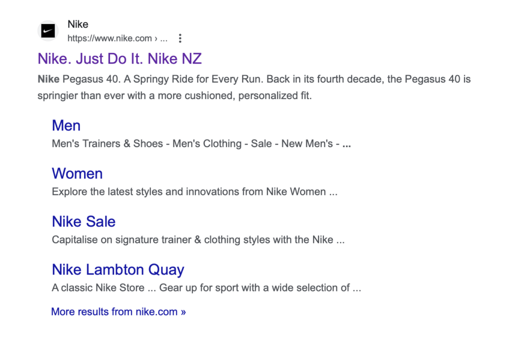
Consider integrating the tagline into your SEO title so visitors can see it even in Google search results.

Infuse Your Visual Branding
Logo
Your logo is often the first element that catches visitor’s attention on your website and is a direct link to your brand name.
Here are some considerations for effectively positioning your logo:
- Top-Left Corner: Placing your logo in the top-left corner is a common practice. It’s where most people instinctively look when visiting a website.
- Centre: Some websites also place the logo in the centre, especially if they have a navigation menu designed for this position. Recently, the trend has also been placing the logo across the hero area on the homepage, which works for some but not every business. Why? It loses valuable space to address visitors and their problems.
Regardless of the placement, ensure your logo is in a high-resolution file format, ideally SVG.
Also, consider whether an animation of the logo would be an option. This can be particularly interesting for companies that work with moving pictures, such as in the motion graphics industry.
Brand Colours
Use your brand colour palette for your website design—and stick to it systematically.
For example, you could set one of your primary brand colours for headlines, buttons, illustrations and other vital elements.
Secondary colours work well for backgrounds and text.
You may want to avoid pure black or white; adding a touch of colour to backgrounds and text will increase your brand recognition, even if it’s barely noticeable to the naked eye.
When choosing colours, you should also consider the proportions. Equal proportions of each colour can look unbalanced.
For example, the Starbucks website uses its signature Green throughout to evoke a sense of familiarity and reinforce the coffeehouse atmosphere.
Brand Typography
When selecting brand fonts for your website (and all other touchpoints), align them with your brand’s personality.
Your font choice can hugely impact the look and feel of your brand—whether you’re aiming for a modern, professional, or playful look.
For example, as a law firm, you might choose formal serif fonts, while a creative agency might use more playful, modern fonts.
When working with fonts, you should also establish a clear typographic hierarchy and assign title tags (H1, H2, H3, etc.). Stick to the correct order. This creates a clean, logical layout and optimises your website for SEO.
Ideally, you should only use one or two typefaces and not too many fonts (styles). This helps create a coherent and professional appearance and achieve faster loading times.
An example of effective font use is the New York Times website, which uses a classic, easy-to-read serif font for its articles, living up to its reputation as a trusted source.
Consistent Imagery
In addition to fonts, logos, and colours, your website’s images and graphics should also align with the rest of your branding.
Whether you use custom illustrations, photography style, or motion design, ensure the images are consistent with your brand’s overall aesthetic.
You could use vibrant, colourful illustrations when your brand has a playful personality. On the other hand, if your brand is professional and formal, high-quality photographs with a clean and polished look might be more appropriate.
For instance, Drink Haus uses its distinctive image style on its website—rich, candid, and warm.
Consistent Layout
A consistent layout throughout your website is essential for a seamless, recognisable and polished user experience.
You can achieve this, for example, by having a consistent number of columns, placing headings in the same place and using white space.
Ultimately, a consistent layout improves the navigation of your business website and strengthens your brand image.
Tap into Your Brand’s Storytelling
Brand storytelling is a powerful tool for building connections on your website.
Brand storytelling does not only mean copywriting but can also be done through images, testimonials or infographics to tell stories that make your brand more relatable and human.
For example, consider featuring a customer success story on your “Home” or “Services” page, demonstrating how your offering has made a difference in the customer’s life.
Your “About Us” page is perfect for sharing how your brand originated and its mission.
For example, Patagonia’s website has a “Stories” section to tell narratives about its mission to save the environment.
I also like how Studio Arde has seamlessly integrated its mission to support women-led businesses into its 404 page.
Create a Seamless User Experience
We’ve touched on your brand elements. Now, let’s not overlook the importance of a solid user experience.
Navigation and Site Structure
Your website’s structure should be both logical and user-friendly. Create an environment where visitors can easily find the information, products, or services they seek.
Consider the customer journey and establish a logical flow that guides users through your site to where you want them to go.
Integrating functions such as chatbots can offer visitors personalised support and quick assistance.
In addition, it is advisable to integrate a well-structured FAQ section. This allows visitors quick answers to frequently asked questions.
These measures help to improve the user experience and signal how important the user is to your company. They also save you time and resources.
Responsive Design
Make absolutely sure your website has a responsive design, which means it works seamlessly on all devices. This not only ensures a seamless user experience but also positively reflects on your brand.
Make it a “Brand Hub”
Consider linking to and from other sites, news articles about your brand, and your social media profiles.
Offering easy access to all your brand-related content communicates that your company is on top of its communications.
Social icons and feeds on your website also encourage visitors to connect with your company on other platforms.
Regular Updates
Keep your website content fresh and up-to-date. Outdated information can give the impression of a neglected brand.
What Tool Should You Use to Build Your Business Website?
You might not have started building your website and might be wondering which website builder or content management system (CMS) you should use.
With numerous options available, the choice can seem daunting.
Platforms like Webflow, Squarespace, Showit, Weebly, and Wix all provide user-friendly interfaces and drag-and-drop functionality.
But one website builder stands out for me. I always recommend Elementor paired with WordPress, the combination we use to build our clients’ sites.
Why? WordPress is a widely used CMS known for its flexibility and extensive range of plugins. This allows you to build anything from simple blogs to complex e-commerce sites.
With Elementor, you have complete control over your design elements and layout customisation without extensive coding knowledge.
With its intuitive drag-and-drop interface, paired with the functionality of WordPress, Elementor will help you create a stunning, functional website without breaking the bank.
Conclusion
Strong branding is more than just an original logo; it’s creating a comprehensive identity that embodies your brand’s values, personality and distinctive character.
Integrating your branding seamlessly into your business website creates a consistent and memorable user experience. This promotes trust and recognition, which, in turn, attracts more visitors and turns them into loyal customers.
A well-designed website increases credibility, drives user engagement and leads to more conversions.
A strong brand presence on your website has the potential to be a game-changer, setting you on a path to success.
You may also like my article on why brands still need a website in 2024.
Need help refining your branding and creating a website that speaks volumes? I’ve teamed up with a WordPress and Elementor expert to make projects like yours happen.
Let’s talk about your project. Just contact me to get started.
Disclosure: This article contains affiliate links. But I wouldn’t recommend it if I weren’t fully convinced of the product’s quality.
Title image by MART PRODUCTION


