But even though $4.7 trillion is spent on global marketing every year, Ipsos says that 85% of that investment—about $3.995 trillion—is effectively wasted.
The reason is as simple as it is costly. Much of that budget is spent on assets that are lacking a recognisable or distinct identity. If people see your ad but don’t know it’s you, you aren’t building a brand—you’re simply donating your budget to the media platforms.
So, what’s going wrong?
Before we answer that, let’s revisit the main purpose of branding. While branding can serve many goals, these three stand out:
- Differentiating your brand from the sea of sameness.
- Building an emotional connection that drives loyalty.
- Making your brand so memorable that it remains instantly recognisable—even when the name is hidden.
This article focuses on the third goal, brand recognition.
The easier it is for people to spot and recall your brand, the more likely they are to choose it. This is particularly true in those fast, low-consideration moments, where the brain naturally chooses the path of least resistance—like grabbing a snack at a petrol station or picking a toothpaste brand.
But what actually makes a brand recognisable?
Since branding is often more emotional than rational, the answer can feel vague. Luckily, research gives us some clarity, and that’s where distinctive brand assets come into play.
TL;DR
If you don’t have time for the full guide, here is what the research says about building a brand that sticks:
- Repetition is everything: Recognition is built by repeating the same distinctive assets across every touchpoint
- Most effective assets: Product shapes (31% reach “Gold” status), logos (19%), and mascots (16%)
- Least effective: Taglines (6%) and colour alone (4%)
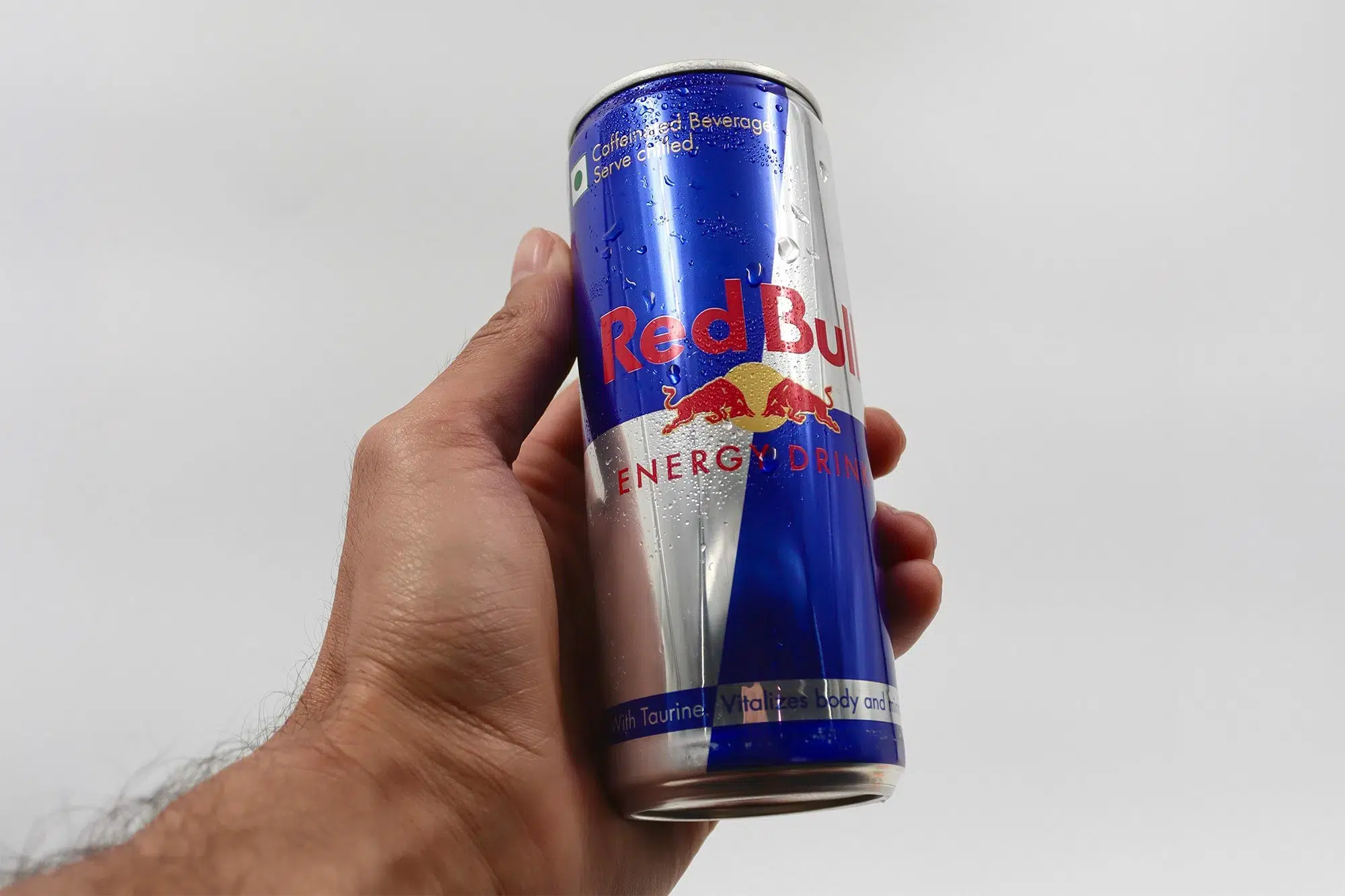
- Colour works best as: A signature combination paired with shapes—think Red Bull’s blue and silver quarters
- Start small, then scale: Ideally, you want one asset from every category (sound, shape, face, etc.). But for most businesses, it’s better to master a few assets first—say your logo, colour, and font. Make those unmistakable before you try to add more.
- The long game: Memory structures take years to build, so be patient
What does ‘recognisable’ mean for a brand?
A recognisable brand is easy to spot, quick to recall, and incredibly hard to forget. It stands out from the crowd and feels familiar, ensuring people connect the experience to the right company—even when the brand name isn’t front and centre.
When people recognise your brand, they are more likely to remember it the moment a specific need arises—that’s also called mental availability. It basically means, they notice you on the shelf and choose you over a competitor they’ve never heard of.
But before a brand can be recognised, it first needs to be known.
Think of it this way:
- Brand awareness is someone knowing that Oatly makes oat milk.
- Brand recognition is them spotting the quirky carton instantly on a busy supermarket shelf.
Once awareness is established, your distinctive brand assets do the rest, making your brand identifiable across every channel and context.
And the challenge is, they don’t do that on their own. It takes deliberate work to build up people’s memory structures.
Further reading
Learn more about how you can build brand awareness organically.
Research on brand recognition
This article draws on three key sources that define our modern understanding of branding:
- Jenni Romaniuk’s Building Distinctive Brand Assets.
- The Be Distinctive Everywhere report by JKR and Ipsos (based on 5,000+ assets across 500+ brands and 26,000 people in 25 countries)
- Martin Lindstrom’s Buyology, a three-year neuromarketing study into how our brains actually respond to brands
The JKR + Ipsos report categorises assets into three tiers—bronze, silver, and gold—based on how strongly they trigger brand recall without the brand name being shown.
Interestingly, only 15% of tested assets made it to gold.
The findings suggest that most brands are sitting on “Bronze” assets—elements that might look good but do almost zero work in helping a customer identify the brand in the wild.
To understand why so many fall short, we have to look at the individual building blocks of recognition. Let’s start with the one most people get wrong: colour.
Distinctive brand assets as the building blocks of brand recognition
Now let’s get practical. Which types of brand assets actually help your brand stand out?
Let’s start with the most talked-about—and often misunderstood—asset: colour.
1. Colour: Does it Really Boost Recognition by 80%?
You’ve likely heard that colour can boost brand recognition by up to 80%. It’s a compelling figure often cited in design circles, but it is rarely put into context. The reality is that colour alone is almost never enough. The JKR x Ipsos report found that a only 4% of brand colours tested actually reached “Gold’ status.
Jenni Romaniuk’s research reinforces this. Colour consistently ranks the lowest among brand assets in both fame and uniqueness.
And that makes sense. Most industries share a very similar palette. Is red and yellow McDonald’s, Kodak, Shell, or Marmite? Even Coca-Cola’s red wouldn’t be nearly as recognisable without the support of the curved white ribbon and that iconic script font.
That said, colour has one unique biological advantage. It is the only visual cue we process when we aren’t fully focused. This makes it incredibly useful in busy, cluttered environments—like a crowded supermarket aisle or a fast-scrolling social feed.
According to the research, colour works best in three specific ways:
- As a single ownable colour: Think Cadbury’s purple or Tiffany’s blue (difficult and expensive to achieve).
- As a signature combination: Like Google’s specific four-colour sequence.
- Paired with shapes and layout: Like Red Bull’s blue and silver slanted rectangles.
In all three cases, consistency is key. To build that “memory structure” we talked about, you have to use the exact same colours, in the exact same way, every single time.
What I’ve learned as a brand designer
In my work with small businesses, colour is almost always the first thing clients want to decide. But it’s never where I start.
Without a massive advertising budget, it’s nearly impossible to own a single colour the way Tiffany or Cadbury do. What small businesses can realistically own is a consistent colour-shape combination or the specific feeling the palette evokes.
When you use that combination repeatedly across every single brand touchpoint, it eventually becomes uniquely yours.
Key takeaway
Colour alone rarely creates strong brand recognition. But when combined with other distinctive assets and used relentlessly, it becomes a powerful anchor for your brand.
On that note, you might like my article on avoiding common pitfalls when choosing brand colours.
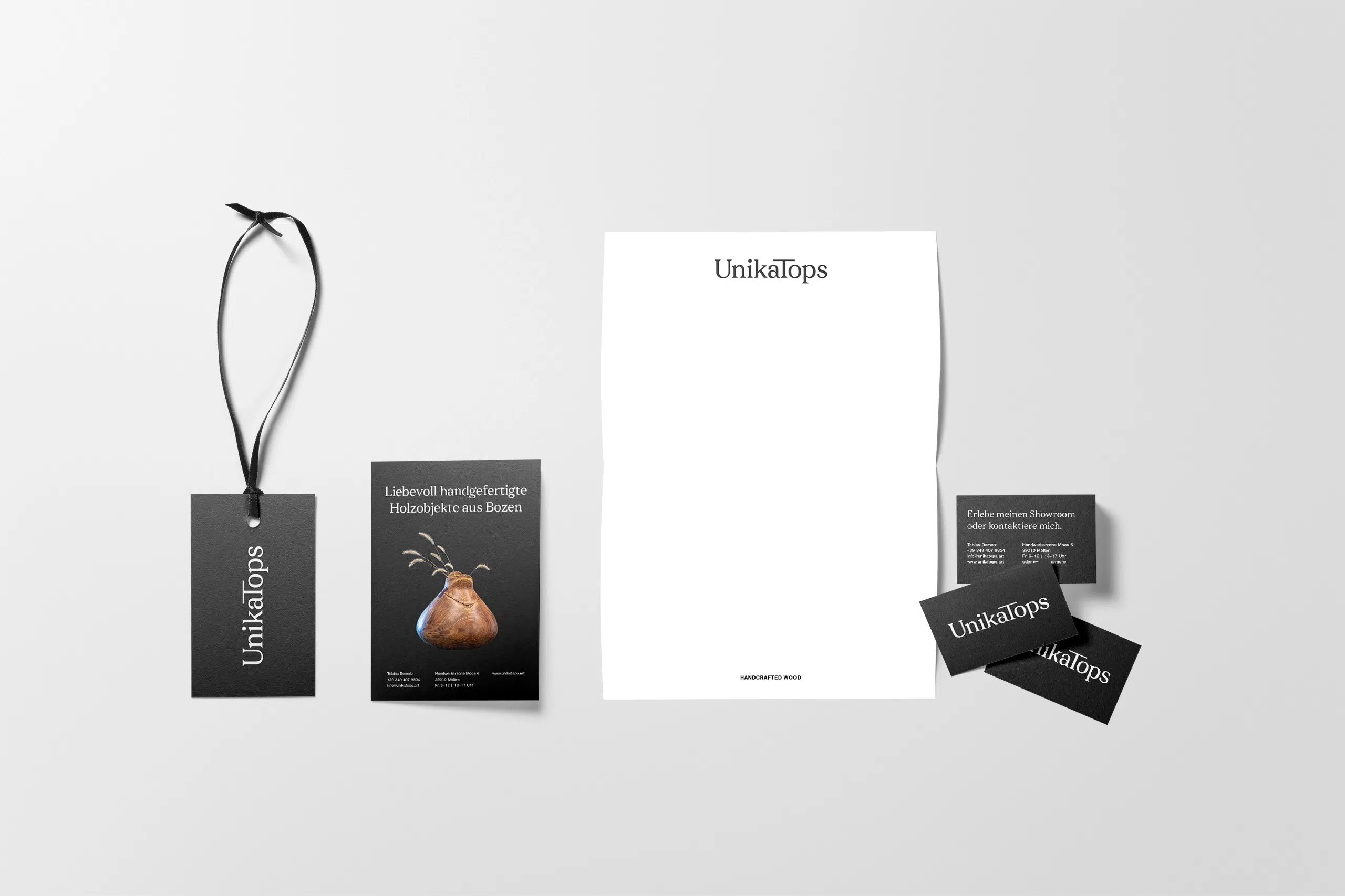
2. Logos: What makes them so recognisable?
When it comes to brand recognition, your logo is one of the most powerful assets you have. The JKR x Ipsos report found that 19% of logos tested reached gold status, making them significantly more effective for brand recall than colour alone.
Logos work because they are processed holistically. We read the shape, colour, and font all at once as a single unit of information. This is why these elements need to work together as a cohesive whole, rather than just looking good individually.
A strong logo stands out within its industry—that often means doing the opposite of what everyone else is doing.
Generally, you have two paths:
- Literal logos, like WhatsApp’s speech bubble, are instantly understandable but often offer less uniqueness, because they’re so generic.
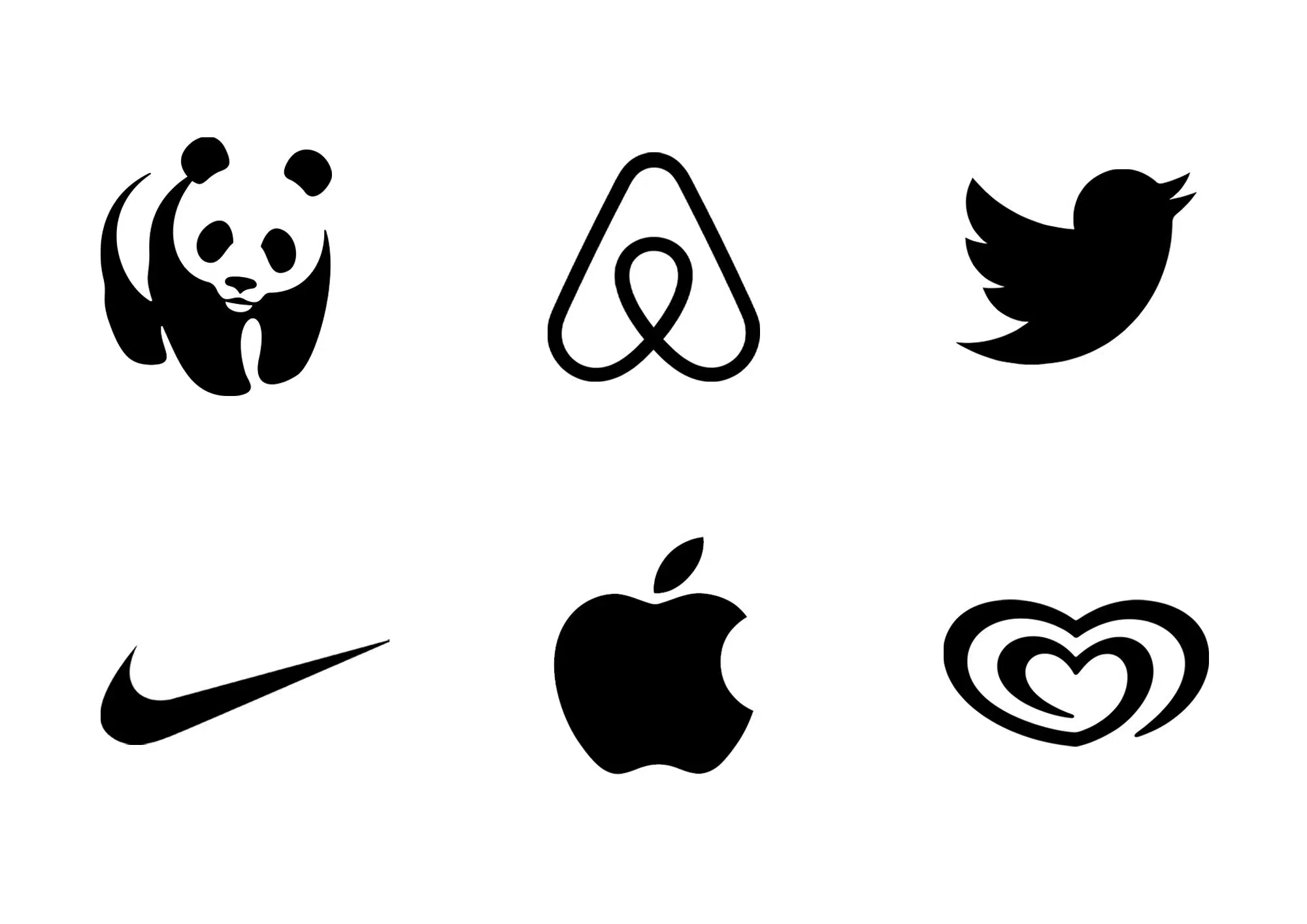
- Abstract logos, like Nike’s swoosh, take longer to build recognition, but are harder to copy and easier to protect legally.
Neither is inherently better; what matters is consistency over time.
The Adaptability Test
Adaptability is just as important as the design itself. A logo needs to work across every touchpoint—from a business website header to a favicon or a social media icon.
Brands like Mastercard and Amazon have designed logos that flex across contexts without losing their identity.
What I’ve learned as a brand designer
What I see most often with small business logos is that they’re designed in isolation. People don’t often think about how they’ll work across touchpoints.
A logo that looks great on a business card can become unreadable or even boring as a favicon or social media icon. Adaptability is something I always test from the start.
Key takeaway
A great logo stands out in its industry and works seamlessly across every touchpoint while still triggering brand recall.
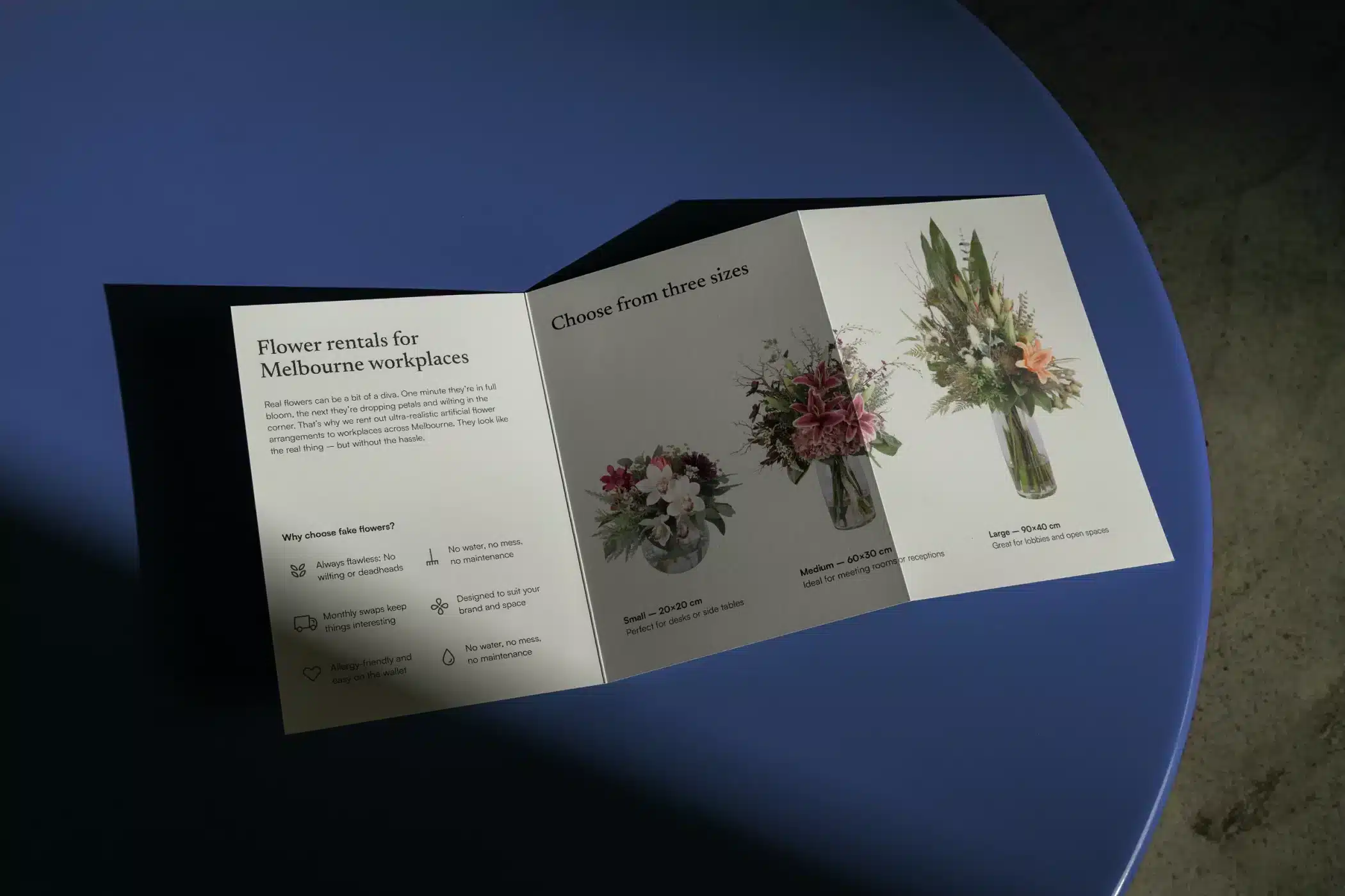
3. Shapes: How do products and packaging stand out?
Beyond logos, shapes can become powerful brand assets in their own right. They generally fall into three categories:
Symbols: These are shapes used independently of a wordmark, like the Nike swoosh. They trigger brand recall even without a name in sight. However, shapes often carry pre-existing meanings—a cross might be read as religious or medical before it’s read as yours.
Product shapes: Think of the Mini Cooper’s silhouette. Martin Lindstrom’s research found that viewing iconic product shapes like an iPod or a Ferrari triggers similar brain activity to religious images. That is how deeply they can affect us. The catch is that most people only interact with the physical product after they’ve bought it.
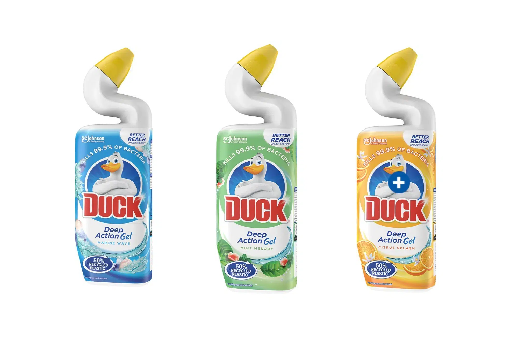
Packaging shapes: The triangular Toblerone packaging or the curved neck of a Duck toilet cleaner bottle are instantly identifiable. In Duck’s case, the shape reinforces the brand name, the character, and the communication all at once.
The JKR x Ipsos report found that products—defined as the combination of form, packaging, photography, and user experience—are the most powerful brand asset overall. A staggering 31% of products tested achieved “Gold” status.
The caveat
Online, products often appear as small, flat thumbnails. Finer 3D details can easily get lost. These days, you have to design for both the physical shelf and the digital screen.

What I’ve learned as a brand designer
Most small business owners don’t think about shape as a branding tool at all. For service-based businesses especially, it rarely comes up naturally because there is no packaging and no physical product on a shelf.
But the principle still applies. The shapes you use on your presentations, proposals, social media templates, and even the layout of your invoices are your version of packaging. When used consistently, they contribute to recognition more than you’d realise.
Key takeaway
Shapes achieve the highest recognition when they’re distinctly different within their category and when they work both in person and online.
4. Faces: Which type works best for brands?
Humans are biologically wired to recognise faces; it is instinctual. But when it comes to branding, not all faces work equally well as distinctive assets. Research suggests they generally fall into three categories of effectiveness:
- Celebrities: They grab attention instantly, but they come with baggage. Their own personal associations can often overshadow the brand—a phenomenon known as the “Vampire Effect.” While long-term partnerships like Nespresso and George Clooney can work, they are the exception, especially if the celebrity endorses multiple brands at once.
- Spokespeople can be more effective precisely because they grow with the brand. Their association strengthens over time. Many founders now act as the face of their own brand, especially on LinkedIn and Instagram. This can build genuine connection, but also comes with risk. If their public image shifts, the brand goes with it. Tesla and Elon Musk are an example.
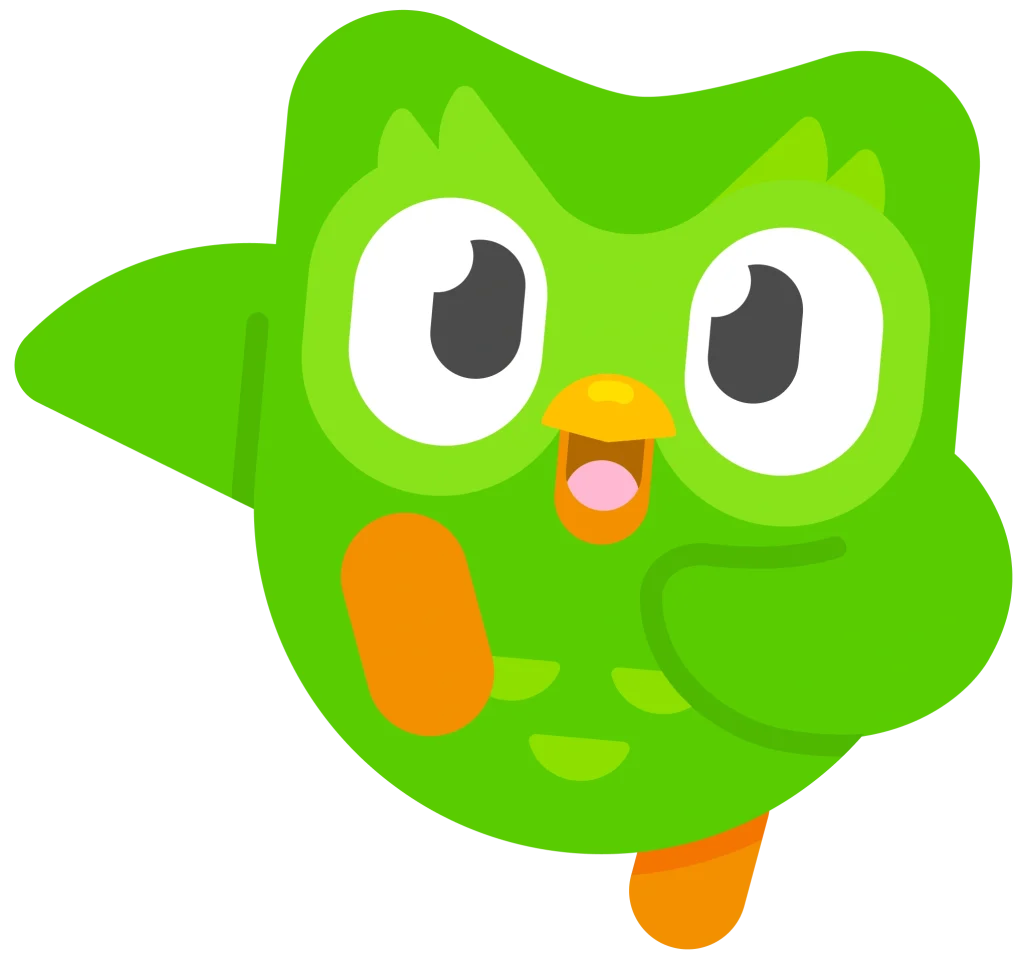
- Mascots score the highest in fame and uniqueness of all face types. The Be Distinctive Everywhere report found that 16% of mascots achieved “Gold” status. The biggest advantage is here is control. You design a character that fully reflects your brand personality, and it never ages, has a bad day, or gets caught up in controversy. Examples are Freddy from Mailchimp or Duo from Duolingo.
What I’ve learned as a brand designer
I’m seeing more founders use themselves as the face of their brand, especially on LinkedIn and Instagram. It can work really well for small businesses. After all, people buy from people.
But it’s worth thinking about the long-term implications. If you ever want to sell the business, step back, or simply have a week off, the brand recognition goes with you.
Key takeaway
Faces work because they are instinctual. And mascots offer the highest recognition with the lowest personal risk.
If you are the face of your brand, consider how you can build other “memory structures” that exist independently of your personal presence.
5. Images: How do they create brand association?
Images weren’t a primary focus of the Ipsos or Romaniuk research, but Martin Lindstrom’s Buyology gives us a peek into their psychological impact.
In one experiment, Lindstrom showed smokers two distinct types of visuals:
- Obvious ones: Cigarette packs and logos.
- Subtle ones: Cowboys, Ferraris, and sunsets—images that weren’t branded but evoked the vibes of classic cigarette ads.
Surprisingly, the subtle images triggered stronger cravings than the logos themselves. And even more striking was that the graphic anti-smoking warnings actually intensified the desire to smoke rather than reducing it.
The reason is quite simple. Images stir our memory and emotion more deeply than a logo ever could. They bypass the logical brain and tap directly into long-standing emotional associations. Even negative imagery can trigger a positive response if it is tied to an established memory structure.
What I’ve learned as a brand designer
This doesn’t just apply to big brands with custom campaigns. In my work, I always help clients develop a consistent image style—even when they’re using stock images.
The mood, colour palette, and subject matter all contribute to recognition over time, often more than people expect. It’s about building a “world” that feels familiar before the customer even reads a single word of copy.
If you don’t have a big budget, yet, you might like my selection of the best authentic stock photo sites.
Key takeaway
Sometimes, it’s not the logo or tagline that sticks—it’s the image that taps into your brand’s emotional heritage. Subtle, well-chosen imagery often builds deeper associations than anything overtly branded.
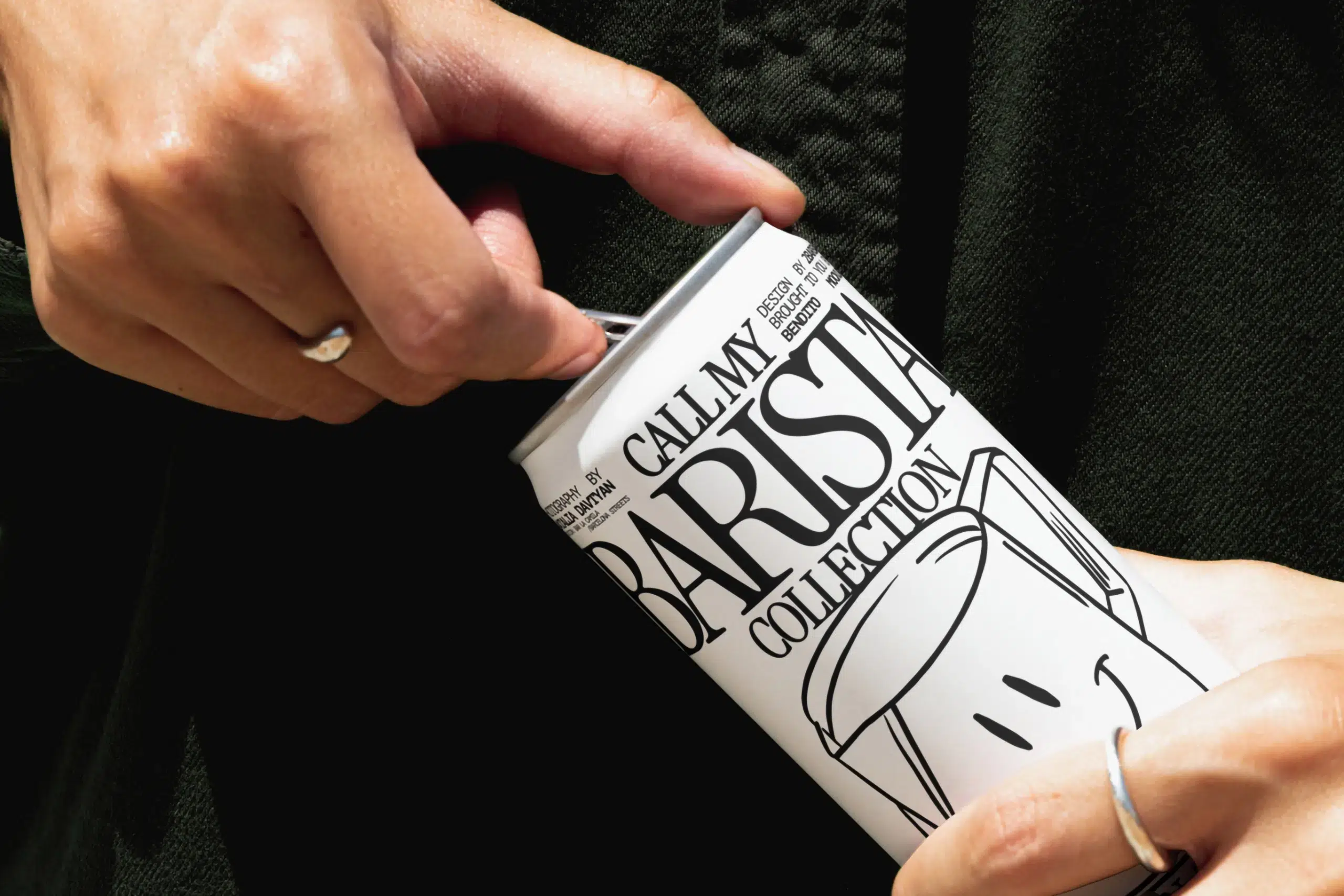
6. Fonts: Can they help with brand recognition?
Brand fonts aren’t usually what people notice first, but they can become unmistakably yours over time. According to Jenni Romaniuk, we rarely register fonts in isolation; we experience them as part of a bigger picture, paired with colours, logos, and layouts. While a font on its own often has low “cut-through,” consistent use can make it a powerful distinctive asset.
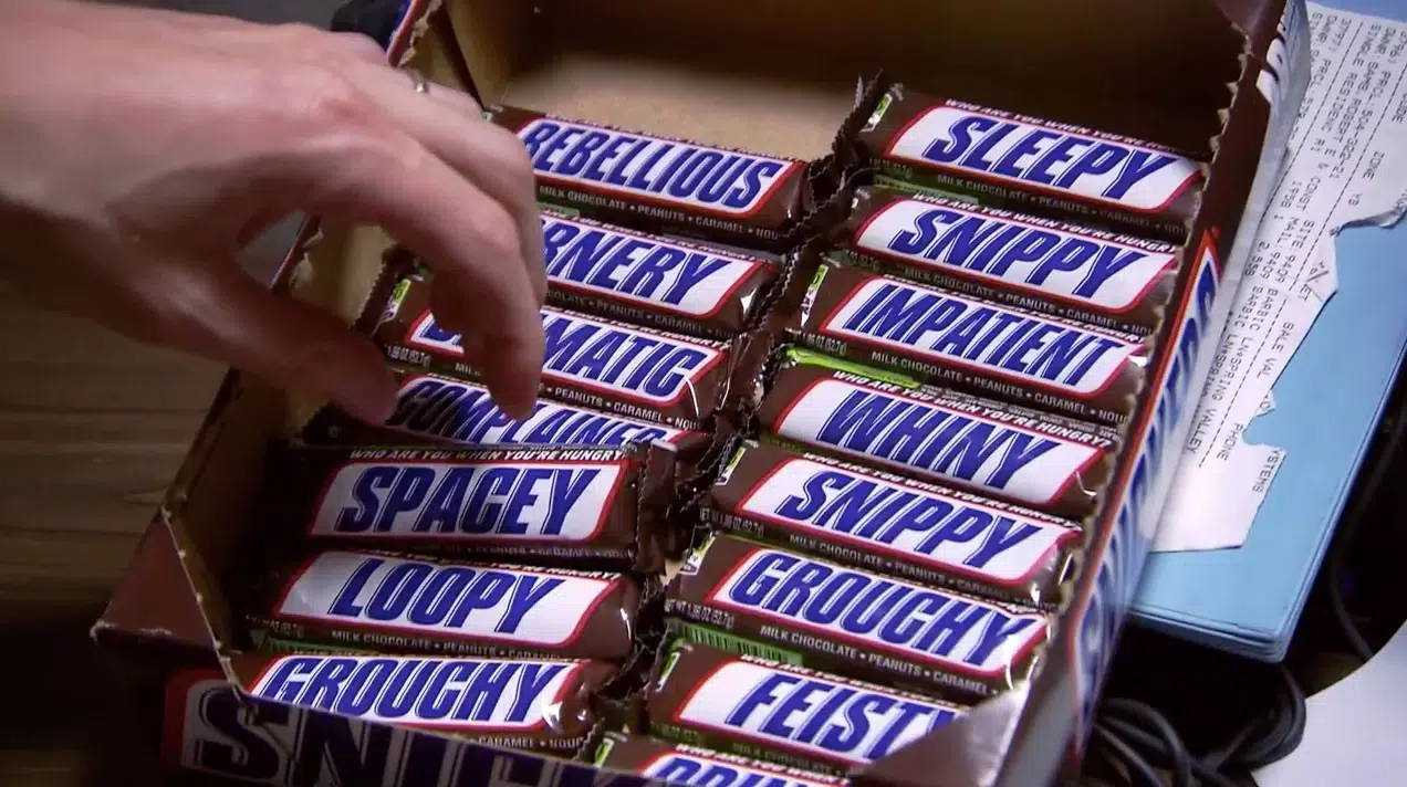
The Snickers example illustrates this well. When the brand swapped its name for words like “Hungry” or “Dizzy,” people still recognised the bars instantly.
But it wasn’t just the font doing the work. The red frame, the bold blue lettering, and the white-on-brown colour combination all triggered that memory structure simultaneously.
Custom vs. standard typography
- Standard fonts: These rely entirely on consistency. Using the same typeface across your website, invoices, and social media builds a sense of order.
- Custom typography: This takes recognition further. Coca-Cola’s flowing script or Disney’s fairytale lettering are harder to copy and carry the brand’s entire heritage.
What I’ve learned as a brand designer
In my experience, fonts are the most neglected brand asset for small businesses.
Even after we’ve developed a full brand identity together, some clients still use random fonts in their social media posts. It immediately breaks the consistency we’ve worked to build and the branding starts falling apart.
And another learning: if you choose very distinctive fonts that are trendy at the time, they might be easier to recognise, but they are not as timeless and become dated as soon as the trend passes—which might force you into a premature rebrand.
Key takeaway
Fonts rarely work alone. But used consistently and in combination with other assets, they can become unmistakably linked to your brand.
7. Taglines: Why are they hard to make distinctive?
Taglines are tricky. According to the Ipsos report, only 6% reached “Gold” status, which is low given how much time brands spend crafting the perfect phrase.
The problem is that taglines are made of words, and words already carry meaning. A tagline has to fight for attention not just against competitors, but against everything people already associate with the language you’re using, and against the brand name itself. To work, they have to cut through all that noise.
There are a few ways to make them more distinctive:
- Add sound: McDonald’s “ba-da-ba-ba-ba” proves how a jingle can turn even a simple phrase into a global memory structure.
- Include your brand name: This strengthens recognition and makes it easier to recall. Plus, you can always drop the name later once the association is set.
- Use uncommon or quirky words: Anything unexpected will stand out and has a higher chance to be remembered.
- Ask a question: Questions invite mental engagement and tend to stick in the mind longer than a statement.
Surprisingly, research shows that rhyme and length have little to no effect on how distinctive a tagline actually is.
What I’ve learned as a brand designer
The 6% “Gold” rate doesn’t surprise me. In my experience, even when we develop a strong tagline together, it rarely gets used consistently enough to build real recognition.
It appears on the website, maybe on a business card, and then it disappears. A tagline only works if you commit to it long-term across nearly every touchpoint. If you’re not willing to repeat it for years, it won’t become tied to your brand.
Key takeaway
Don’t try to say everything with your tagline. Aim for something simple, sticky, and a bit unexpected. These 50+ iconic tagline examples might give you a good starting point.
8. Story: How do recurring cues help with brand recall?
Brand stories aren’t just narratives with a beginning, middle, and end. According to Jenni Romaniuk, they are built from recurring cues—subtle signals that, over time, make a brand unmistakable.
These fall into three types:
- Styles: These are the patterns or themes that thread through everything the brand puts out. Think of the wing motif in every Red Bull ad, the bright lab-like setting in Progressive commercials, or Mastercard’s “Priceless” tone. You don’t need to see the brand name; you just know.
- Moments: These are signature actions tied to a specific point in time. They are simple, repeatable, and easy to own—like twisting open an Oreo or dropping a lime into a Corona.
- Components: These are physical cues people link directly to your brand, like Apple’s white earbuds or the grey cat on a Whiskas pack.
The power of rituals
Martin Lindstrom’s research adds that rituals make brands stickier. They give people something to do, creating a sense of familiarity and comfort.
Whether it’s waiting for a Guinness to settle or customising your Subway sandwich, these small “story moments’ turn the customer into an active participant in the brand—which is gold.
My thoughts as a brand designer
One thing I’d add is: recurring cues only feel powerful when they’re held together by a coherent brand narrative.
Take Red Bull. “Gives you wings” is the central idea that holds everything together. It’s the wing motif in the ads, the extreme sports sponsorships, the fearless athlete stories, and the tagline. Without that central idea, you just have a collection of assets. With it, you have a brand.
Key takeaway
A brand story isn’t a one-time narrative; it’s a collection of recurring narratives, cues and rituals. To build recall, you have to commit to these elements over decades, not just one campaign.
9. Sound: Which type is most effective?
Now that we’ve covered visual and verbal assets, let’s talk about the senses we usually ignore.
We’re evolutionarily wired to be hyper-sensitive to sound—it grabs our attention and bypasses our logic to hit our emotions instantly. But sound doesn’t automatically trigger brand recall just because it’s loud. It has to be structured.
Romaniuk groups brand sounds into three categories:
- Non-vocal sounds: Think of the Intel “Bong.” These are recognizable, but they usually struggle to build a deep brand connection on their own without millions in ad spend.
- Vocal sounds: These are much more effective. The human voice creates an instinctive connection, and if that voice is unusual or has a specific character, it’s even harder to forget.
- Rhythmic patterns: Think of the “heartbeat” rhythm in Mastercard’s campaigns. Our brains are built to respond to repetition, making rhythmic patterns easier to store in our long-term memory.
The role of music
Brands also use music as a strategic tool, but not all music is equally effective:
- Jingles: These stick through melody. If the brand name is part of the tune, recall strengthens significantly.
- Popular songs: These bring instant emotion, but they carry a high risk: the song can “vampire” the brand’s attention, or simply feel dated within a few years.
- Background music: This is excellent for building a subconscious mood, but it rarely builds a specific brand association on its own.
The visual-sound-combination
In an experiment, Martin Lindstrom tested the neurological response to a small group of iconic brands—including Nokia, Microsoft, and British Airways—to see how their visual and audio cues interacted.
The results showed that in three out of four cases, showing the logo and playing the brand sound at the same time significantly improved both recall and positive emotional preference.
The outlier was Nokia. And I think it’s because the ringtone had become so associated with “interruption”—think phones going off in the middle of a meeting—that it triggered a negative response. When paired with the logo, the sound didn’t help—it actually dragged the brand’s preference down.
Key takeaway
Prioritise distinct vocal cues, repeatable rhythms, or custom jingles that clearly link to your brand. And if you’re pairing sound with visuals, even better.
10. Other Sensory Cues: When do they work best?
Scent, taste, and touch can trigger powerful emotional responses, sometimes even stronger than visuals or sound. Just think of the signature scent at a W Hotel or the nostalgic smell of Play-Doh.
But there’s a catch. These cues are almost always perceived after purchase. That makes them great for reinforcing loyalty and the vibe of your brand, but weak at building recognition before a buying decision is actually made.
The same goes for taste in food and beverage brands, and touch, like packaging texture or product feel.
That said, in a digital world, these physical sensory cues feel intriguing and experiential precisely because they’re rare.
If you want to explore this idea a bit deeper, I wrote an article on sensory branding and how brands can use it to build a deeper connection.
Back to your question: What makes a brand recognisable?
The answer is simple: repetition.
You need a clear set of brand assets used consistently across every single touchpoint. Whether it’s your logo, brand colour palette, or a mascot—the more often people encounter these elements, the more likely they are to remember them and associate them with your name.
Romaniuk suggests aiming for a “menu” of 4 to 5 distinctive assets, ideally pulling one from each category: sound, face, story, colour, shape, and words.
My approach as a brand designer
When I work with small businesses, I never start with five assets. Most don’t have the budget—or the internal discipline—to build that many at once.
I usually recommend starting with just a few: typically the logo-colour-font combination. The goal is to make those unmistakable before you even think about adding anything else.
So, are your brand assets actually doing their job? If not, what could you simplify right now to boost your recognition? A brand audit is a great first step to figure that out.
And if you’re starting from scratch or refining what you have, I can help build identities that actually stick. Because if you want to be recognisable, you need a strategy with assets that are designed to be distinct and consistent.
Frequent questions on brand recognition and awareness
What is brand recognition?
Brand recognition is the ability of your audience to identify your brand from a sensory cue—like your logo, colour combination, packaging shape, or even a sound—without needing to see your name. That instant identification is what distinctive brand assets are designed to build.
What’s the difference between brand recognition and brand awareness?
Brand awareness is someone knowing your brand exists and what it offers. Brand recognition means they can identify you from a visual or sensory cue alone, even before they read your name. You need awareness first—people have to know Oatly makes oat milk before they can spot the carton instantly on a shelf.
What are the stages of brand recognition?
Recognition is actually one stage in a longer journey—what’s sometimes called the brand familiarity ladder—from someone who’s never heard of your brand to someone who’d never consider switching. The stages are:
- Awareness: people know your brand exists
- Recognition: they identify it on its cues
- Preference: they choose it over alternatives
- Trust: they rely on it
- Loyalty: they don’t consider switching
Why does brand recognition matter for a small business?
There are a few reasons that build on each other.
- It builds trust. There’s a psychological effect called the mere exposure effect. The more familiar something feels, the more we trust it. And the more people trust your brand, the more willing they are to pay for it.
- It makes your marketing work harder. If people see your content but don’t connect it to your brand name, that investment builds nothing. Recognition ensures every touchpoint is attributed to your brand.
- It wins the moment of decision. When someone is ready to buy, you want to be the one they reach for, not a competitor whose brand looks confusingly similar to yours.
As a small business, you don’t need global recognition. Just make sure you’re recognised by the people who’re most likely to hire or buy from you.
A small note: To support this blog, I use affiliate links for the books mentioned above. I chose to link to Bookshop.org to help support independent bookstores rather than Amazon. If you buy through these links, I may earn a small commission at no extra cost to you.
Title image by Havva Yılmaz